Single Cell Publication - Data Plotting
| Author(s) |
|
| Reviewers |
OverviewQuestions:
Objectives:
Requirements:
Time estimation: 1 hourLevel: Advanced AdvancedSupporting Materials:Published: Nov 7, 2024Last modification: Nov 7, 2024License: Tutorial Content is licensed under Creative Commons Attribution 4.0 International License. The GTN Framework is licensed under MITpurl PURL: https://gxy.io/GTN:T00470version Revision: 1
Best viewed in RStudioThis tutorial is available as an RMarkdown file and best viewed in RStudio! You can load this notebook in RStudio on one of the UseGalaxy.* servers
Launching the notebook in RStudio in Galaxy
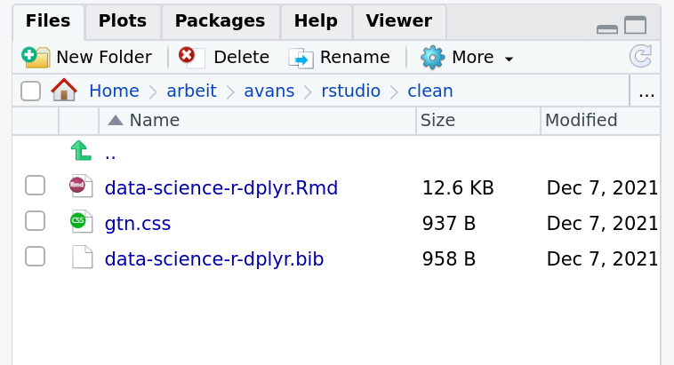
- Instructions to Launch RStudio
- Access the R console in RStudio (bottom left quarter of the screen)
- Run the following code:
download.file("https://training.galaxyproject.org/training-material/topics/contributing/tutorials/meta-analysis-plot/contributing-meta-analysis-plot.Rmd", "contributing-meta-analysis-plot.Rmd") download.file("https://training.galaxyproject.org/training-material/assets/css/r-notebook.css", "gtn.css")- Double click the RMarkdown document that appears in the list of files on the right.
Downloading the notebook
- Right click this link: tutorial.Rmd
- Save Link As...
Alternative Formats
- This tutorial is also available as a Jupyter Notebook (With Solutions), Jupyter Notebook (Without Solutions)
Hands On: Learning with RMarkdown in RStudioLearning with RMarkdown is a bit different than you might be used to. Instead of copying and pasting code from the GTN into a document you’ll instead be able to run the code directly as it was written, inside RStudio! You can now focus just on the code and reading within RStudio.
Load the notebook if you have not already, following the tip box at the top of the tutorial
Open it by clicking on the
.Rmdfile in the file browser (bottom right)
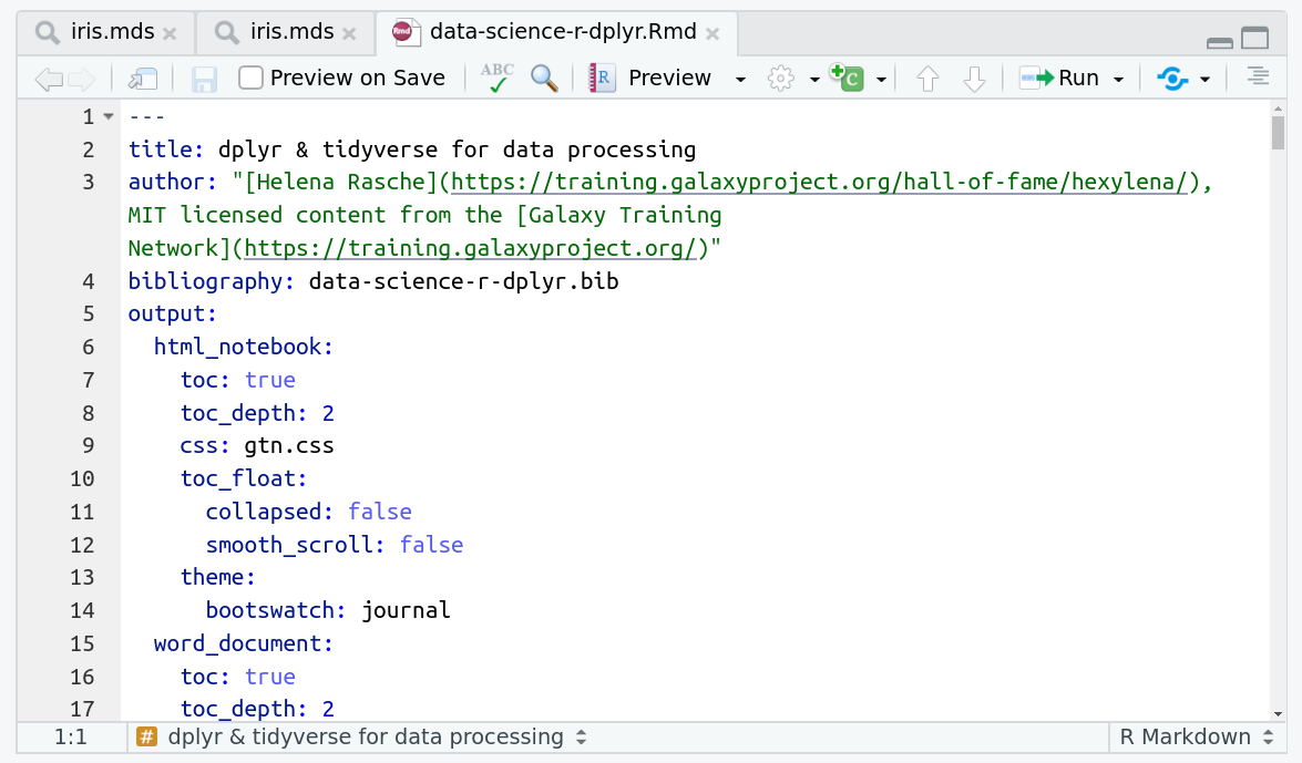
The RMarkdown document will appear in the document viewer (top left)
You’re now ready to view the RMarkdown notebook! Each notebook starts with a lot of metadata about how to build the notebook for viewing, but you can ignore this for now and scroll down to the content of the tutorial.
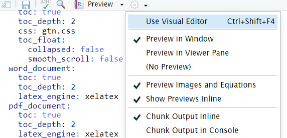
You can switch to the visual mode which is way easier to read - just click on the gear icon and select
Use Visual Editor.
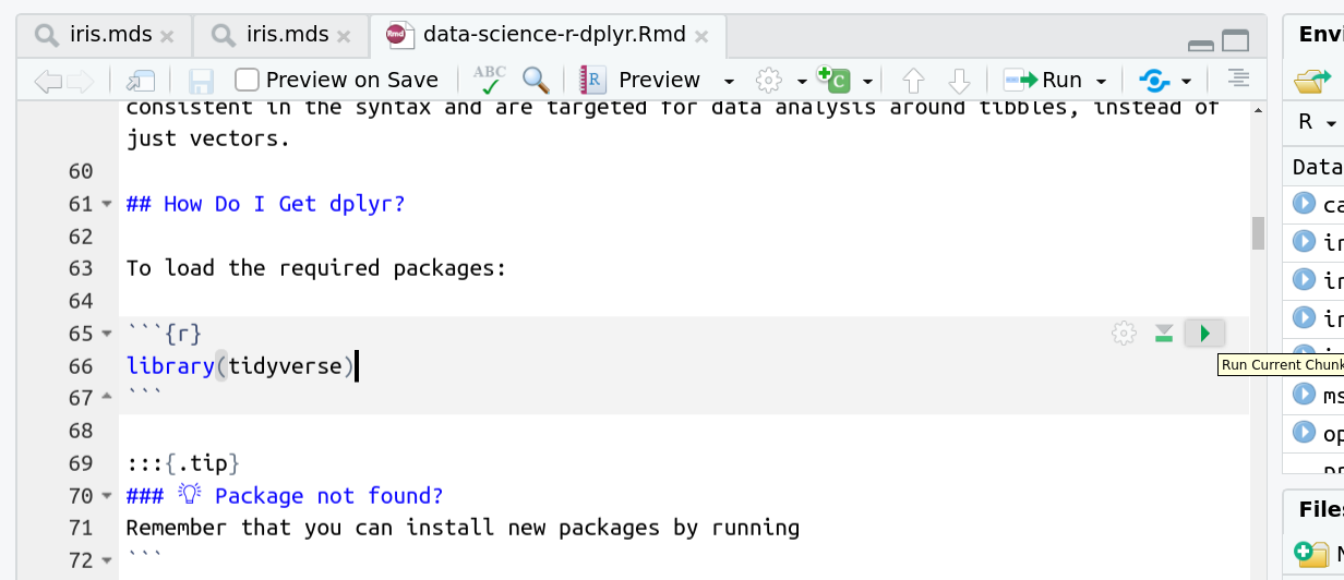
You’ll see codeblocks scattered throughout the text, and these are all runnable snippets that appear like this in the document:
And you have a few options for how to run them:
- Click the green arrow
- ctrl+enter
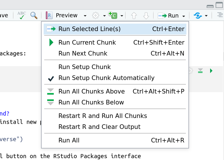
Using the menu at the top to run all
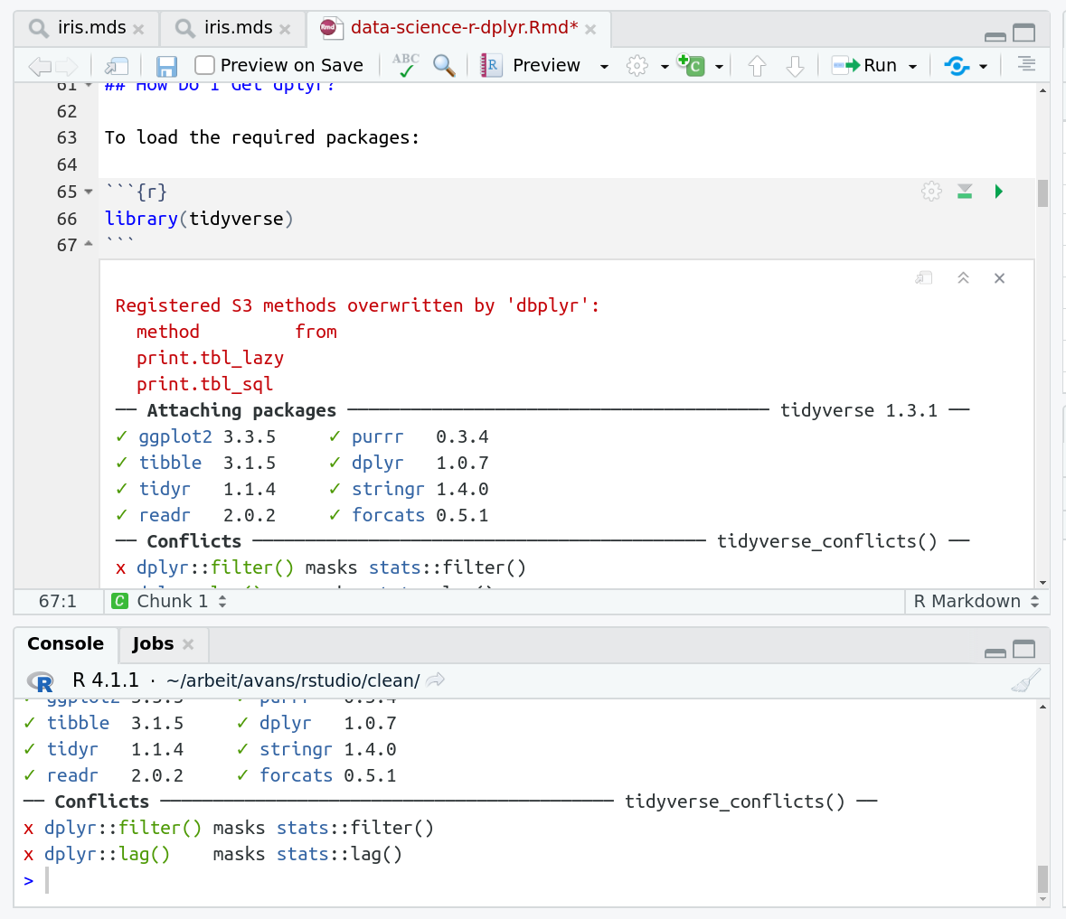
When you run cells, the output will appear below in the Console. RStudio essentially copies the code from the RMarkdown document, to the console, and runs it, just as if you had typed it out yourself!
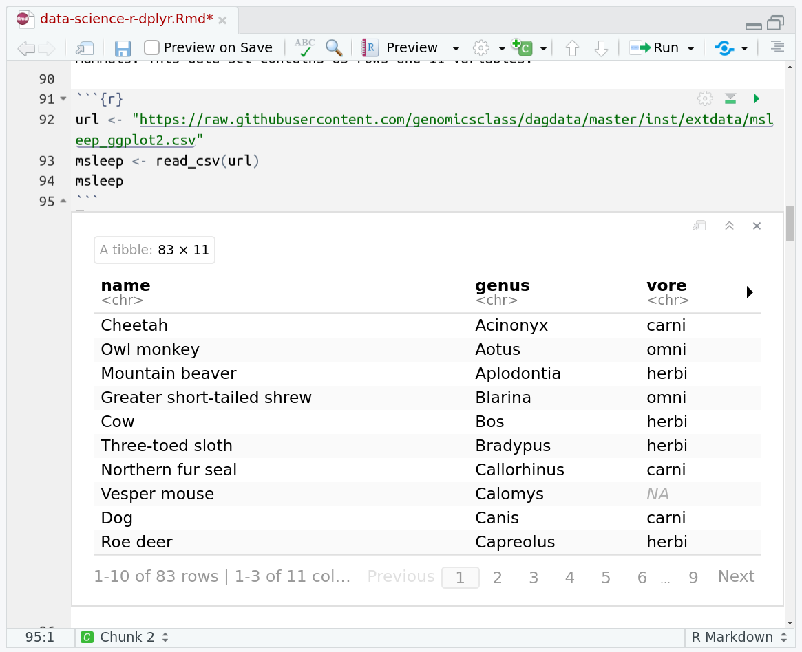
One of the best features of RMarkdown documents is that they include a very nice table browser which makes previewing results a lot easier! Instead of needing to use
headevery time to preview the result, you get an interactive table browser for any step which outputs a table.
We’ll use some ggplot and tidyverse code to plot the data we collected in part 1
AgendaIn this tutorial, we will cover:
We’ll use tidyverse (which includes things like magrittr (%>%) and ggplot2) to load our data. Reshape2 provides the cast/melt functions which can be used to reshape specific datasets into formats that are easier to plot.
library(tidyverse)
library(reshape2)
# This path will probably need to be changed depending on where you downloaded that dataset.
data = read_tsv("sc.tsv")
Data Cleaning
Let’s start by cleaning our data a bit. We’ve got a couple problems with it:
- there might be some null mergedAt dates, we’ll want to remove those
- we probably want to ignore a couple of classes of datasets that were added/removed (images, and the explicit ‘ignore’ type.)
clean = data %>%
	select(num, class, additions, deletions, mergedAt) %>%
	filter(!is.na(mergedAt)) %>%
	group_by(num, class, mergedAt, month=floor_date(mergedAt, 'month'), quarter=floor_date(mergedAt, 'quarter')) %>%
	summarise(additions=sum(additions), deletions=-sum(deletions)) %>%
	filter(class != "ignore") %>%
	filter(class != "image") %>%
	arrange(mergedAt) %>%
	as_tibble()
We’ll setup a ‘theme’ for our plot that mainly consists of using the black and white theme which is quite elegant and readable, and then making some font sizes a wee bit larger:
theme = theme_bw() + theme(
  axis.text=element_text(size=14),
  plot.title=element_text(size=18),
  axis.title=element_text(size=16),
  legend.title=element_text(size=14),
  legend.text=element_text(size=14))
We want all of our plots to look the same which is why we use this trick, it helps us keep a consistent aesthetic without having to re-type the configuration every single time.
Let’s get to plotting!
Plot: Lines added/removed by date/time period
We have a dataset that looks like:
clean %>% head(10)
We’ll want to plot the changes versus the time (either quarter or month), and
then maybe plot them differently based on the class of the addition/removal. So that translates into an aesthetics statement like aes(x=time, y=additions, fill=class)
In ggplot2 you can plot data some different ways, if you provide the datasets upfront, e.g. data %>% ggplot() you’ll generally do something like data %>% ggplot(aes(x=a, y=b)) + geom_something() and geom_something will take the data from the ggplot call. However if you want to plot multiple series, you can also provide the data directly to the geom_* functions like so:
ggplot() +
  geom_col(data=clean, aes(x=quarter, y=additions, fill=class)) +
  geom_col(data=clean, aes(x=quarter, y=deletions, fill=class)) + scale_fill_brewer(palette = "Paired") +
  geom_point(data=clean, aes(x=mergedAt, y=0), shape=3, alpha=0.3, color="black") +
  theme +
  xlab("Quarter") + ylab("Lines added or removed") + guides(fill=guide_legend(title="Category")) +
  ggtitle("Lines added or removed by file type across GTN Single Cell Learning Materials")
ggsave("sc-lines-by-quarter.png", width=12, height=5)

ggplot() +
  geom_col(data=clean, aes(x=month, y=additions, fill=class)) +
  geom_col(data=clean, aes(x=month, y=deletions, fill=class)) + scale_fill_brewer(palette = "Paired") +
  theme +
  geom_point(data=clean, aes(x=mergedAt, y=0), shape=3, alpha=0.3, color="black") +
  xlab("Month") + ylab("Lines added or removed") + guides(fill=guide_legend(title="Category")) +
  ggtitle("Lines added or removed by file type across GTN Single Cell Learning Materials")
ggsave("sc-lines-by-month.png", width=12, height=5)
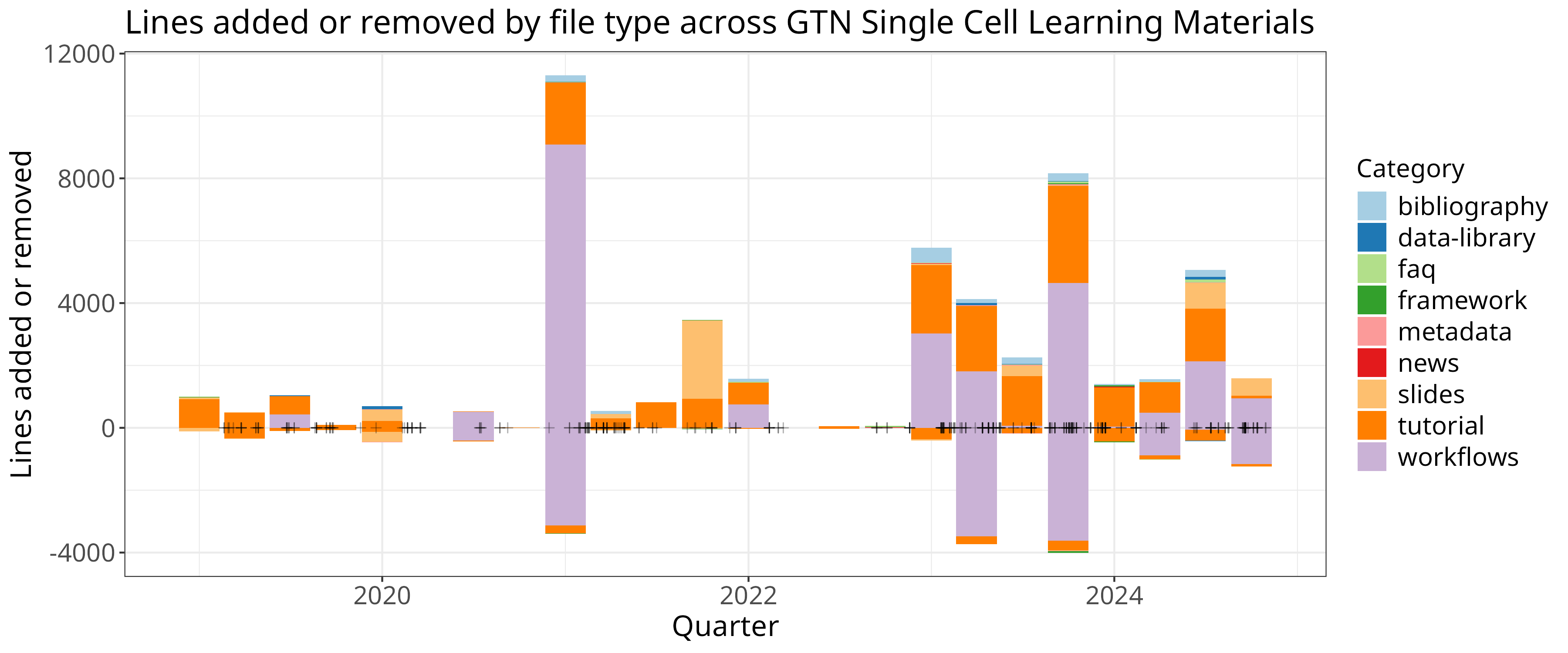
In this case we plotted the data for additions and deletions separately, and we additionally added points based on the actual date of the PRs to visualise their density.
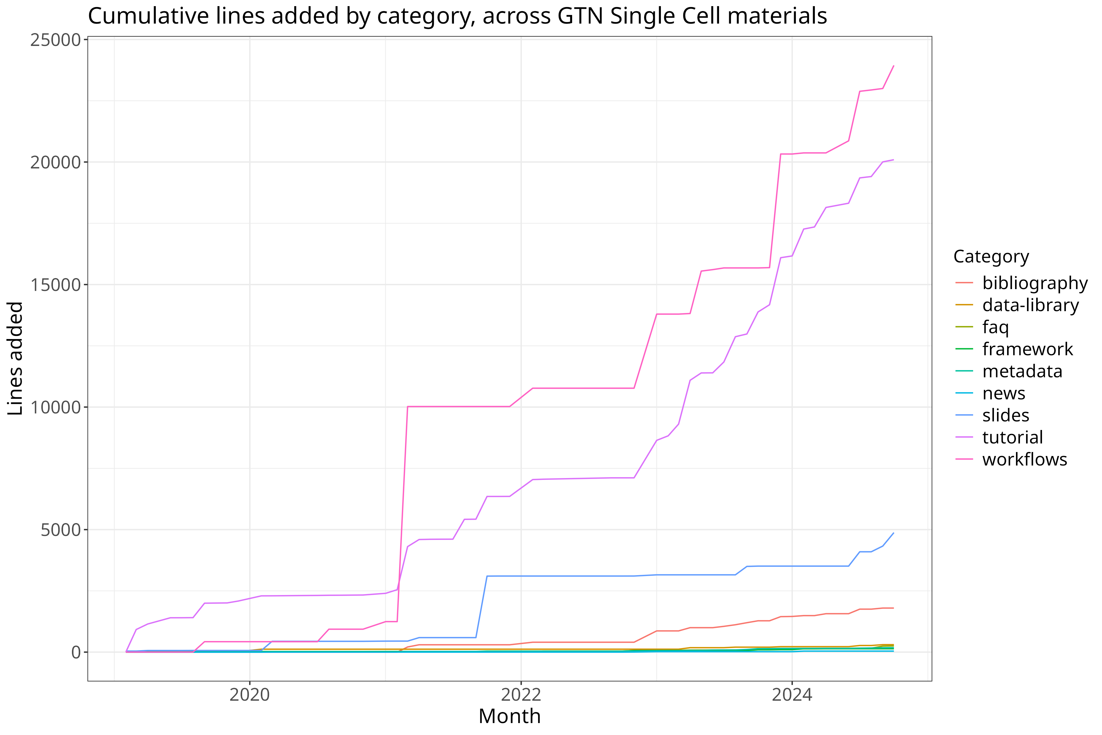
Let’s produce
Wendi Bacon
‘s favourite running sum plots in addition. We’ll start by reshaping our data. Currently we have data that looks like:
| time | variable | value |
|---|---|---|
| today | measure1 | 1 |
| today | measure2 | 10 |
| yesterday | measure1 | 30 |
| yesterday | measure2 | 5 |
And we’ll re-shape this to look like this, which will make it easier to calculate changes over the course of a specific series:
| time | measure1 | measure2 |
|---|---|---|
| today | 1 | 10 |
| yesterday | 30 | 5 |
We’ll use the dcast function to do that:
clean %>% select(month, class, additions) %>% dcast(month ~ class, value.var="additions") %>% head()
That doesn’t look quite right so, let’s change how the data is aggregated:
# cumulative
clean %>% select(month, class, additions)  %>% dcast(month ~ class, value.var="additions", fun.aggregate = sum)
Let’s do it for real now:
cumulative = clean %>% select(month, class, additions)  %>%
  dcast(month ~ class, value.var="additions", fun.aggregate = sum) %>%
  mutate(across(bibliography:workflows, cumsum)) %>%
  reshape2::melt(id.var="month")

cumulative %>% ggplot(aes(x=month, y=value, color=variable)) + geom_line() +
  theme_bw() + theme +
  xlab("Month") + ylab("Lines added") + guides(color=guide_legend(title="Category")) +
  ggtitle("Cumulative lines added by category, across GTN Single Cell materials")
ggsave("sc-lines-cumulative.png", width=12, height=8)
Contributions over time
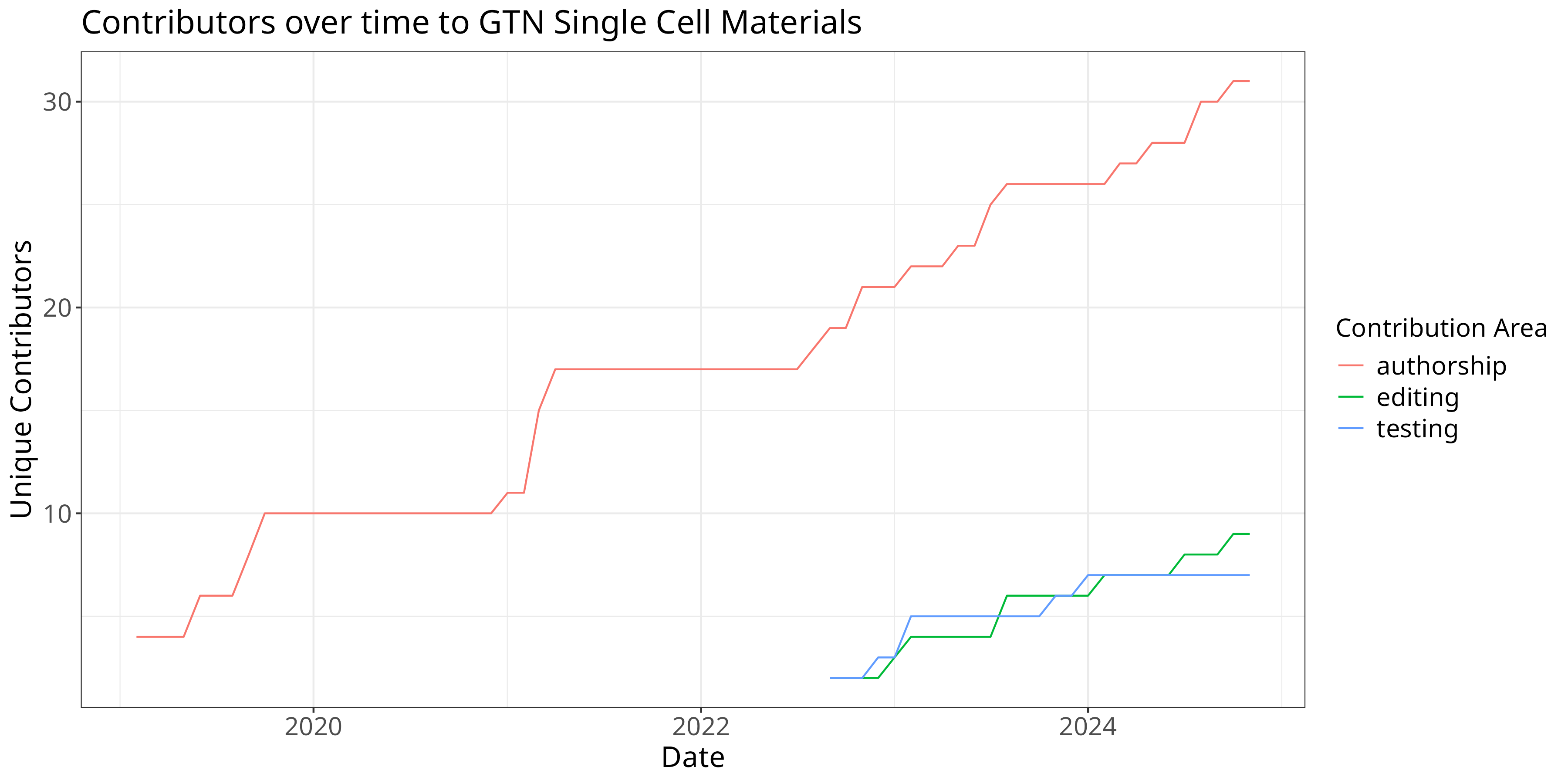
Let’s again start with some cleaning, namely removing all rows with 0 records, and removing future records (at the time of writing.)
roles = read_tsv("sc-roles.tsv")
w = roles %>%
  filter(count != 0) %>%
  filter(!grepl("2025", date)) %>%
  filter(!grepl("2024-12-01", date))

w %>%
  ggplot(aes(x=date, y=count, color=area)) +
  theme +
  xlab("Date") + ylab("Unique Contributors") + guides(color=guide_legend(title="Contribution Area")) +
  ggtitle("Contributors over time to GTN Single Cell Materials") +
  geom_line()
ggsave("sc-contribs.png", width=12, height=6)
New X over Time
Let’s plot all of the new single cell things added over time, all the new FAQs, Tutorials, Slides, Etc:
added_by_time = read_tsv("single-cell-over-time.tsv")
added_by_time %>% dcast(date ~ `type`) %>%
  arrange(date) %>%
  mutate(across(event:workflow, cumsum)) %>%
  melt(id.var="date") %>%
  as_tibble() %>% arrange(date) %>%
  ggplot(aes(x=date, y=value, color=variable)) + geom_line() +
  theme_bw() + theme +
  xlab("Date") + ylab("New Single Cell Items") + guides(color=guide_legend(title="Contribution Type")) +
  ggtitle("New Single Cell events, FAQs, news, slides, tutorials, videos and workflows in the GTN")
ggsave("sc-files-cumulative.png", width=6, height=6)
We may also want to know how many changes there have been since the start date of this study, e.g. October 1st, 2020:
since_oct = added_by_time %>% dcast(date ~ `type`) %>%
  arrange(date) %>%
  mutate(across(event:workflow, cumsum)) %>%
  filter(date > as.Date("2020-10-01"))

# Pull out the first/last date as our start ane dnwend
start_date = (since_oct %>% head(n=1))$date
end_date = (since_oct %>% tail(n=1))$date

# Table of our changes.
since_oct %>%
  filter(date == start_date | date == end_date) %>%  # Just those rows
  mutate(date = case_when(date == start_date ~ 'start', date == end_date ~ 'end')) %>% # Relabel the start/end as literal string start and end
  pivot_longer(-date) %>% pivot_wider(names_from=date, values_from=value) %>% # Transpose the data
  mutate(increase=end - start) %>% # And calculate our increase
  select(name, increase) %>% arrange(-increase)
Pageviews
GTN uses the Galaxy Europe Plausible server for collecting metrics (you can change your preferences in your GTN privacy preferences).
We can download the data from the server and plot it, filtering by our preferred start/end dates and filters (namely that page includes /topics/single-cell/).
Unfortunately the data is downloaded as a zip file which we’ll then need to extract data from:
system("wget 'https://plausible.galaxyproject.eu/training.galaxyproject.org/export?period=custom&date=2024-11-07&from=2022-08-01&to=2024-11-07&filters=%7B%22page%22%3A%22~%2Ftopics%2Fsingle-cell%2F%22%7D&with_imported=true&interval=date' -O sc-stats.zip")
We can use the unzip function to read a single file directly from the zip:
views = read_csv(unzip("sc-stats.zip", "visitors.csv"))
With that we’re ready to plot. We’re going to use a new feature for our plot,
annotate. Annotation allows you to draw arbitrary features atop your plot, in
this case we’re going to draw rectangles to indicate outages and events that
might have affected our data.
y = 3300
xoff = 3
views %>% group_by(date=floor_date(date, 'week')) %>%
  summarise(date, visitors=sum(visitors), pageviews=sum(pageviews)) %>%
  filter(visitors != 0 | pageviews != 0) %>%
  melt(id.var="date")  %>%
  ggplot(aes(x=date, y=value, color=variable)) + geom_line() +
  annotate("rect", xmin = as.Date("2023-10-01"), xmax = as.Date("2023-10-27"), ymin = 0, ymax = y,  alpha = .2) + # Outage
  annotate("rect", xmin = as.Date("2023-05-22") - xoff, xmax = as.Date("2023-05-26") - xoff, ymin = 0, ymax = y,  alpha = .2) + # Smorg3
  annotate("rect", xmin = as.Date("2024-10-07") - xoff, xmax = as.Date("2024-10-11") - xoff, ymin = 0, ymax = y,  alpha = .2) + # GTA
  annotate("rect", xmin = as.Date("2024-09-16") - xoff, xmax = as.Date("2024-09-20") - xoff, ymin = 0, ymax = y,  alpha = .2) + # Bootcamp
  theme_bw() + theme +
  scale_y_continuous(expand = c(0, 0), limits = c(0, NA)) +
  xlab("Date") + ylab("Count") + guides(color=guide_legend(title="Metric")) +
  ggtitle("GTN Single Cell Visits")
ggsave("sc-pageviews.png", width=14, height=4)
for our lovely pageview plot!

Discuss this with us and we can perhaps generalise this analysis, to reduce the amount of data processing you need to do, and make it more accessible for everyone!

