This tutorial is not in its final state. The content may change a lot in the next months.
Because of this status, it is also not listed in the topic pages.
The data provided here as part of this tutorial analyses single-cell RNA-seq data from a study published by Grün et al. 2016. The data was used to cluster cells from Lgr5-positive intestinal stem cells of C57BL6/J mice, with the aim of discovering distinct cell sub-populations and deriving a lineage tree between them to find out how these sub-populations relate (or are derived from) one another.
The input data consists of a single count matrix consisting of ~21,000 genes (rows) and ~400 cells (columns) in tidy data format, generated via scRNA pre-processing methods using the CelSeq2 protocol.
Comment: Tidy Data
The tidy data convention prevalent amongst the R data analysis community assigns every value to a variable and an observation. The values are the number of reads which are assigned to a particular gene (a variable) that was measured within a specific cell (an observation).
Normally a count matrix consists of integers, but this matrix has undergone an UMI-to-transcript count alteration to correct against UMI errors, yielding decimal values instead. This correction is not that necessary in most datasets but it is used here.
This tutorial will perform cell clustering and lineage construction, as well as exploring some genes of interest.
Every single-cell RNA analysis begins with a count matrix, which contains the raw data required for the downstream analysis. Annotation data such as cell phenotype or gene annotations are often used to enrich and validate the analysis. Cell annotations can sometimes be encoded directly in the cell labelling, as we will later explore in this count matrix.
First, let’s setup our history and initial dataset.
Get data
Hands On: Data upload
Create a new history for this tutorial and name it “RaceID on scRNA”
To create a new history simply click the new-history icon at the top of the history panel:
Click on galaxy-pencil (Edit) next to the history name (which by default is “Unnamed history”)
Type the new name
Click on Save
To cancel renaming, click the galaxy-undo “Cancel” button
If you do not have the galaxy-pencil (Edit) next to the history name (which can be the case if you are using an older version of Galaxy) do the following:
Click on Unnamed history (or the current name of the history) (Click to rename history) at the top of your history panel
Type the new name
Press Enter
Import the file from Zenodo or from the shared data library
Click galaxy-uploadUpload at the top of the activity panel
Select galaxy-wf-editPaste/Fetch Data
Paste the link(s) into the text field
Press Start
Close the window
As an alternative to uploading the data from a URL or your computer, the files may also have been made available from a shared data library:
Go into Libraries (left panel)
Navigate to the correct folder as indicated by your instructor.
On most Galaxies tutorial data will be provided in a folder named GTN - Material –> Topic Name -> Tutorial Name.
Select the desired files
Click on Add to Historygalaxy-dropdown near the top and select as Datasets from the dropdown menu
In the pop-up window, choose
“Select history”: the history you want to import the data to (or create a new one)
Click on Import
Rename the dataset to “intestinal”
Check that the datatype is a tab-separated file
Click on the galaxy-pencilpencil icon for the dataset to edit its attributes
In the central panel, click galaxy-chart-select-dataDatatypes tab on the top
In the galaxy-chart-select-dataAssign Datatype, select tabular from “New Type” dropdown
Tip: you can start typing the datatype into the field to filter the dropdown menu
Click the Save button
Question
How many genes are in the count matrix?
How many cells?
A summary of our dataset is given by expanding the file preview window by clicking on the file name.
20,269 lines, where lines/rows denote our genes.
Scroll the mini-preview window to the right to see that the number of cells are 431
Inspecting the Cell Labelling
Cell labels usually encode which plate, batch, or cell barcode was used to delineate cell. Sometimes all three sources of information are used, which can be valuable information to have when looking for batch effects.
We can inspect the labels of this dataset by clicking on the galaxy-eye symbol. Immediately we can see that the header of this file contains cell names, following a naming convention that separates the cells into 5 batches: I5d, II5d, III5d, IV5d, and V5d
Is each batch equally populated? We can investigate this ourselves by extracting the headers, and reformatting them to see how many unique types we can detect:
Hands On: Task description
Select first ( Galaxy version 1.1.0) with the following parameters:
param-file“File to select”: imported tabular file
“Operation”: Keep first lines
“Number of lines”: 1
Transpose ( Galaxy version 1.1.0)
param-file“Input tabular dataset”: output of Select first
Question
What did this transpose step do? Why is it necessary?
The sole purpose of the Transpose tool is to switch columns with rows (and vice versa), which will make it easier to inspect and sort data.
Text transformation ( Galaxy version 1.1.1) with the following parameters:
param-file“File to process”: output of Transpose
“SED Program”: s/_[0-9]+//
The above text is a regular expression used to match on anything that contains a _ followed by a number, and removing it.
Inspect the generated file and verify that we have the 5 phenotypes without _ followed by a number
Question
How many rows remain after the Text transformation step?
The number of rows has not changed since the last step, but the cell names have lost their numbering and are identified purely by their phenotype.
Datamash ( Galaxy version 1.1.0) with the following parameters:
param-file“Input tabular dataset”: output of Text transformation
“Group by fields”: 1
“Input file has a header line” : Yes
“Print header line”:No
“Sort input”:Yes
“Print all fields from input file”:No
“Ignore case when grouping”:No
In “Operation to perform on each group”
In “1: Operation to perform on each group”
“Type”: count
“On column”: Column: 1
Question
How many unique cell phenotypes were identified in the cell headers?
Which cell phenotype is least represented in the count matrix?
There are 5 types of cells in our count matrix: I5d, II5d, III5d, IV5d, and V5d.
There are only 48 IV5d cells compared to the other types which have 95 or 96.
With these types already labelled in the header of our data, we can validate the clustering that we will perform later. Ideally, the cells described by these 5 different labels should group into 5 separate clusters, with varying degrees of proximity to one another.
Inspecting the Quality of the Count Matrix
Low quality cells and genes are often caught at the pre-processing stage and removed, but sometimes more filtering is required to remove unwanted noise from the data.
A gene with a low number of total counts across multiple cells might be differentially expressed across those cells, however differential gene expression and log fold change do not necessarily denote significant change. 1 count in CellA and 10 counts in CellB yields an LFC of 10, but is not as significant as an LFC of 10 from 100 counts in CellA vs 1000 counts in CellB.
We can refine filtering thresholds by examining how much a histogram of our plots change before and after filtering using standard parameters.
Hands On: Unique Cell Types
Initial processing using RaceID ( Galaxy version 0.2.3+galaxy0) with the following parameters:
Library Size: The total number of transcripts in a cell, or a column sum. The minimum threshold for this can be set by “Min Transcripts” (= 3000).
Gene Transcripts: The total number of transcripts for a gene, or a row sum.
Detectability: This is how many values above a certain threshold exist in a given row/column.
Number of Features: The number of genes detected above a certain threshold.
>0: This is the default threshold when the term Number of Features is used, because it counts any genes with non-zero counts for that cell, and are therefore ‘detected’ during sequencing.
>N: Depending on how lowly sequenced the cells are, sometimes it is useful to set a higher threshold of detectability to guard against sequencing errors or other noise-related factors. The minimum threshold for this can be set by “Min Expression” (= 5).
Number of Cells:
>0: This is the default threshold when the term Detected in X number of Cells is used, because it counts any cells with non-zero counts for that gene.
>N: This raises the detectability threshold to any cell count above N. The minimum threshold for this can be set by “Min Cells” (= 5).
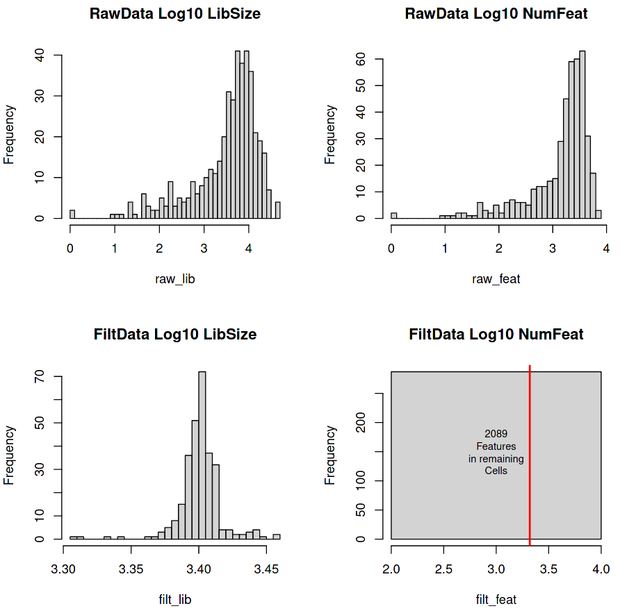
Four histograms are generated with the top line giving the raw expression data fed into the tool, and the bottom line giving the filtered data (cells with at least 3,000 transcripts in total and genes with at least 5 transcripts in at least 5 cells).
Figure 2: RaceID Histograms of raw and filtered data
(Top-Left) Library Size (total number of transcripts per cell)
(Top-Right) Feature Set (total number of detectable genes per cell)
(Bottom-Left) Filtered Library Size (minimum 3000 transcripts per cell)
(Bottom-Right) Filtered Feature Set
The top row shows the count distributions of the Library Size and Number of Features of the raw data using a Log scale on the x-axis (e.g. 2.5 on the Log10 x-axis = \(10^{2.5}\) = 316 counts).
(Top-Left) A lower-tail heavy distribution centred around 3-4 Log10 (~3000) counts per cell , with a few cells having library sizes containing a handful of counts (0-1000).
(Top-Right) Another lower-tail heavy distribution with a peak centred around \(10^{3.5}\) counts. Cells with a low number of features are hard to compare with other cells due to incomplete data. It is possible that these low feature cells (< 100 genes) are rare types and that we should impute their missing values, but it is often more likely the case that these are simply just low-quality cells that will add noise to the clustering.
The bottom row shows the count distributions of the Library Size and Number of Features of the filtered data
(Bottom-Left) The lower-tail of our previous distribution has been trimmed off, which gives an even normal-looking distribution centred around \(10^{3.4}\) transcripts per cell.
(Bottom-Right) Instead of a distribution we have a single bar that indicates that all of our cells have the exact number of features. The red line displays the number of features across all cells (~ \(10^{3.3}\)).
Comment: Choosing Filtering Thresholds
The minimum total filtering threshold of 3000 chosen for this dataset is derived from analysing the Cross-Contamination Plots from the Pre-processing of Single-Cell RNA Data.
This threshold is dependent primarily on the capture efficiency of the cells that were sequenced, with some cell types being easier to capture than others. For example, neuron cells would have a lower filtering threshold of ~1500 compared to the ~3000 used for hematopoietic cells.
RaceID normalises the data to compare all cells using the same set of features. Selected features must be meaningful, describing or contributing to the biological variation in the data. Therefore features should be the most differentially expressed genes across different cells.
The cells that still remain after filtering will have some genes with count values of zero. In some cases this will give a median value of zero, which can make normalisation strategies difficult (e.g. dividing by the median value of a gene may require dividing by zero). For this reason, a value of 0.1 is added to the count data so that these features are not lost during the analysis.
It should be noted that this then assumes that the gene is detectable for that cell (i.e. no errors during sequencing), but that the transcript was very lowly expressed.
The flat square plot (bottom-right) for the post-filtered number of features is square because it shows that the dataset is still a rectangular matrix with C number of cells and G number of genes. For a more ‘realistic’ distribution of features, re-run the tool with “Count filtered features greater than or equal to 1” enabled.
Question
How many cells remain after filtering?
How many genes remain after filtering?
Are these numbers to be expected?
The answer to the first two questions can be seen in log file generated Initial processing using RaceID
287 cells remain (66%)
2089 genes remain (10%)
Yes
Cells:
These are the observations of your dataset, and the more observations you have, the better the model will be. At minimum, 60% of your initial cells should be retained, though this will depend on the quality of your dataset.
Genes:
As the variables of the dataset, the more genes included, the more complex the model. Discovering the few variables that are relevant to the final model, then, is the aim. Genes not differentially expressed between cells will not affect the final model, but serve as stable background metrics against which to measure significantly differentially expressed genes in the initial matrix. It is perfectly acceptable to perform a single-cell RNA-seq analysis with as few as 500 (differentially expressed) genes.
The filtered distributions are what are expected of a properly filtered and normalised dataset (i.e. a count matrix with all observations having roughly the same number of transcripts, but distributed differently across different sets of common features). With this we can now perform initial clustering to see whether we can cluster any of our cells into distinct cell types.
Normalising and Clustering Cells
Normalisation permits the comparison of different samples by refactoring out uninformative variability relating to the size of sample, and other sources of unwanted variability. Clustering, which groups or categorises cells based on their similarity, and is a crucial stage in the analysis after normalisation.
The effectiveness of the clustering relies on the normalisation. The ideal method to normalise single cell RNA-seq data is still a field of active research as it is not a straightforward process due to two potential sources of uncertainty: technological and biological variability.
Figure 3: Sources of unwanted biological variation: (Left) Transcriptional Bursting, and (Right) Cell-cycle Variation
Transcriptional bursting is a stochastic model for the transcription process in a cell, where transcription does not occur as a smooth or continuous process but occurs in spontaneous and discrete ‘bursts’ thought to be only loosely associated with chromatin conformation/availability. It is an effect that is not seen in bulk RNA-seq due to the smoothing effect of measuring average gene expression across a tissue. The effect is more pronounced in single-cell and is hard to model against.
On the other hand, cell-cycle variation is well defined and can be modelled against. As the cell grows from the G1 to the M phase, the amount of mRNA transcribed grows, meaning that cells in the later stages of their cycle are more likely to produce more transcripts of a given gene. Such differences can give false variation that would cluster two cells of the same type but at different time-points separately. Fortunately, there are a well-defined set of genes whose expression is known to co-vary with the cell-cycle, thus this effect can be modelled out.
Technical variation appears in three main forms: Library size variation, Amplification bias, and Dropout events.
Library size variation occurs where two cells of the same cell type may produce a different amount of total transcripts than one another (e.g. due to cell-cycle effects, or differing capture efficiencies), but have a similar proportion of transcripts for specific genes. For example, a neural cell with 10 counts of SOX2 and a library size of 100 and one with 20 counts and a library size of 200 have the same proportion of SOX2. The two cells have different library sizes, but harbour the same expression for that gene because they are of the same cell type.
Amplification bias stems from an uneven amplification of certain transcripts of a cell over others, giving a false number of reads for the number of mRNA molecules actually observed in the cell. Unique Molecular Identifiers can significantly reduce this bias, and are covered more extensively in the Understanding Barcodes hands-on.
Dropout events are the zero counts that are prevalent in the data due to the reduced sequencing sensitivity in detecting reads, which yields many false negatives in the detection of genes, often resulting in over 80% of the count values in the count matrix being zero. A major point to take into account is that some of these zeroes are real (i.e. no transcripts of that gene were detected in that cell) and some of these are false (i.e. the transcripts were never captured due to the low sequencing depth). Modelling this duality in the data and mitigating against it is one of the biggest challenges of normalising single-cell data.
Performing the Clustering
We will attempt to perform some normalisation and clustering using the recommended default settings to see if we can detect different cell types.
Here we assume that there is no unwanted technical or biological variability in the data and that the cells will cluster purely based on their phenotypes. This assumption is not completely without merit, since often the biological signal is strong enough to counter the lesser unwanted variation.
Hands On: Task description
Clustering using RaceID ( Galaxy version 0.2.3+galaxy0) with the following parameters:
param-file“Input RaceID RDS”: outrdat (output of Initial processing using RaceIDtool)
In “Clustering”:
“Use Defaults?”: Yes
In “Outliers”:
“Use Defaults?”: Yes
In “tSNE and FR”:
“Use Defaults?”: Yes
In order to perform clustering, the proximity of cells to one another are first defined by a distance metric
such as Euclidean distance or other.
Figure 5: Euclidean distance between three points (R, P, V) across three features (G1, G2, G3)
The clustering then tries to find groupings of cells using this distance matrix.
Question
Why are there zeroes along the diagonal of the above example distance matrix?
Is there any symmetry in this matrix?
The distance between a point to itself is - nothing!
The distance between point a to point b is the same as the distance between point b to point a using the Euclidean distance metric.
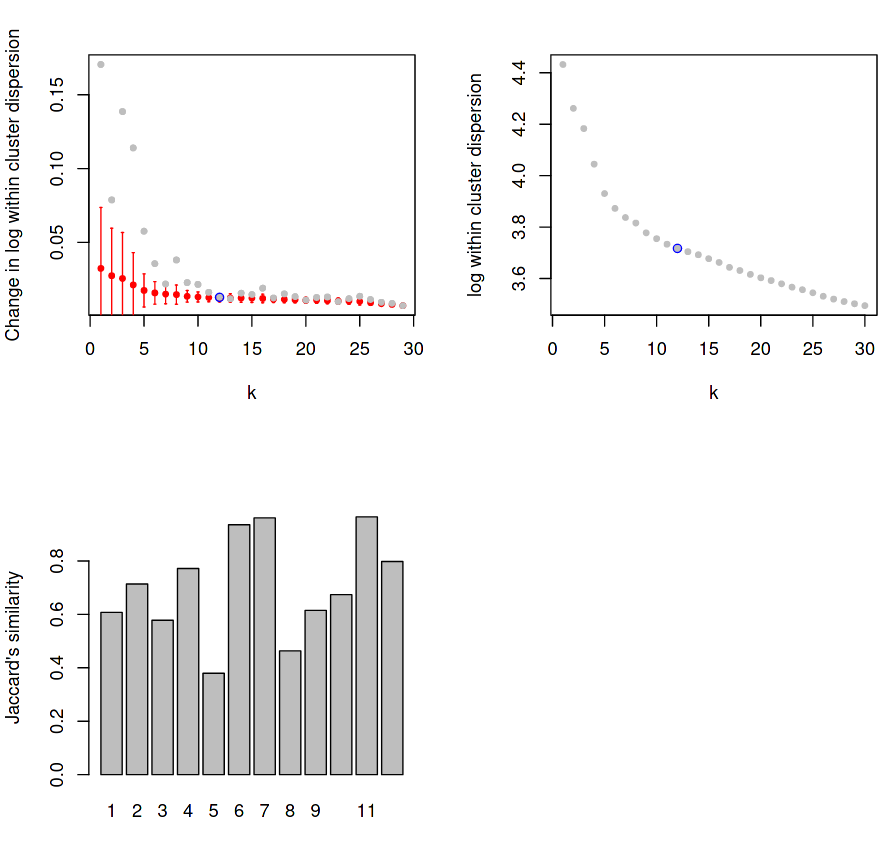
The first three plots in the PDF report tell us about the stability/reliability of our clusters, and are more important indicators for the quality of our clustering than any of the resultant graph projections, such as PCA or tSNE.
Figure 6: RaceID Saturation and Jaccard Distance Plots
(Top-Left) Dispersion within each cluster for given K values, with mean change in dispersion for said K value overlayed.
(Top-Right) Same as top-left, but with the actual dispersion plotted instead of the relative change of dispersion.
(Bottom-Left) Stability for each cluster using Jaccard distance.
The first plot measures the levels of dispersion within each cluster and displays the mean dispersion over all clusters for each k value. The grey points indicate the mean change in dispersion for that k values, and the red bars show this dispersion as a box plot, which get smaller and smaller until a “saturation point” (blue) is reached where the change in dispersion no longer decreases for an increase in k.
For example, if k=2, then all cells will be sorted into 2 clusters, and the variance of the gene expression in each cluster will be measured and averaged to give a score for the clustering at that k value. Certain values of k may cluster the cells of the same type better, with the expectation that the average dispersion of expression values across all clusters will be minimised for some value of k. As k increases, the reduction in this dispersion is measured for each increase of k until the change in the mean within-cluster dispersion no longer changes. Here we can see that reduction saturates at k=12, which is chosen to the be the number of clusters detected in our data for all further analysis.
The third plot measures the direct stability of each of the derived (in this case, 12) clusters using the Jaccard distance, which is a fractional quantity that measures the dissimilarity between two sets as measured by overlap divided by the union of both sets.
Jaccard distance is measured by the intersection of the two or more sets divided by the union of those sets.
In the case of single-cell data, sets are defined as the cells contained within a given cluster, and the Jaccard similarity score provides a quantitative measure for how distinct a given cluster is, based on its similarity to other sets.
Here, for each of the 12 clusters, the (top N) genes expressed by the cells in each cluster are intersected with the (top N) genes expressed by the cells in all other clusters to measure how unique the expression profile is to that specific cluster. The scales given by the plot are actually measuring the dissimilarity between sets, which is one minus the index, therefore a higher y-value is better.
Ideally the Jaccard distance should have above 0.6 in most clusters, but it is acceptable to have one or two more poorly defined clusters.
Outlier Detection
Outlier detection attempts to refine the initially detected clusters to find smaller (sub-)clusters that could be used to define rarer cell types.
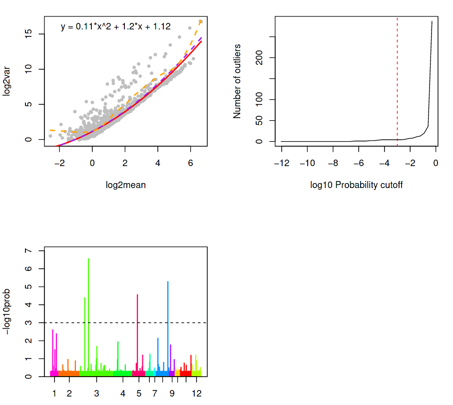
The next three plots attempts to do this by describing the variation of the gene expression, given by; a Background plot, a Sensitivity plot, and an Outlier probability plot.
(Top-Left) Outlier identification via background model based on distribution of transcript counts within a cluster.
(Top-Right) Outlier cells are detected if the probability for that cell \(c\) that a minimum number of genes \(G\_{min}\) of observing total counts \(T\_{G\_{min}}\) is less than a specific threshold \(P\_{thr}\), as given by the red dotted line.
(Bottom-Left) Outlier probabilities of all cells in all clusters.
(Top-Left) A background model is calibrated and outliers are identified based on the distribution of transcript counts within a cluster. The counts for each gene are assumed to follow a negative binomial distribution determined by the average expression of a gene across all cells in a cluster, along with a dispersion parameter.
The dispersion is derived from the average variance-mean dependence, modelled as a logarithmic second order polynomial under the assumption that:
Most genes are not differentially expressed between clusters
True biological variability is located within a handful of genes
In the background model, the upper and lower (violet and red) regression of the variance on the mean (as approximated by a second-order polynomial in logarithmic space) is higher than the variance of most genes (all grey dots below the red curve). This is expected since they are not differentially expressed, and so the genes above the background regression are therefore significant in the detection of outlier cells. The orange line is the local regression (moving average variance per mean) and is used purely for illustrative purposes.
(Top-Right) Outlier cells are detected if the probability for that cell \(c\) that a minimum number of genes \(G\_{min}\) of observing total counts \(T\_{G\_{min}}\) is less than a specific threshold \(P\_{thr}\), as given by the red dotted line.
This is shown in the chart above as the number of outliers as a function of the probability threshold, which is set to \(1 \cdot 10^{-3}\) by default. Ideally, this threshold should be chosen so that the lower tail of the distribution contains as few outliers as possible (i.e. lower than the steep rise in outliers towards the higher end of the plot) to ensure a maximum sensitivity of this method. If the sensitivity of the sequencing was low, then only a few highly expressed genes would be reliably quantified, so the outlier probability threshold would need to be higher (e.g. up to 1).
(Bottom-Left) A bar plot of the outlier probabilities of all cells across all clusters. All outlier cells are merged into their own clusters if their similarity exceeds a quantile threshold of the similarity distribution for all pairs of cells within one of the original clusters. After the outlier cells are merged, then the new cluster centres are defined for the original clusters after removing the outliers. Then, each cell is assigned to the nearest cluster centre using k-partitioning.
The most differentially expressed genes (below a maximum p-value cutoff) in each of the clusters can be seen in the output file Clustering using RaceID on data: Cluster - Genes per Cluster, with 7 columns describing:
Column
Description
.
Gene Name
n
Cluster number
mean.ncl
Mean expression of gene across cells outside the cluster
mean.cl
Mean expression of gene across cells inside the cluster
fc
Fold-change of mean expression in the cluster, against all remaining cells
pv
Inferred p-value for differential expression
padj
Adjusted p-value using the Benjami-Hochberg correction for the false discovery rate
Question
What is the most significant differentially expressed gene in Cluster 5?
Which cluster has the most genes with a fold-change greater than 30?
One way to answer is this is to scroll through the list and make a mental note of all the genes with a high fold-change value…
…but a better way is to sort the data in descending order on Column 5 using the toolSort tool.
The Genes per Cluster dataset is already sorted by cluster number and then by the adjusted p-value. Scrolling down to the first gene that is in cluster 5, we see that Dmbt11 is the most significant gene in that cluster with an adjusted p-value of 2e-30.
Cluster 11 appears to have the most genes with a fold-change greater than 30.
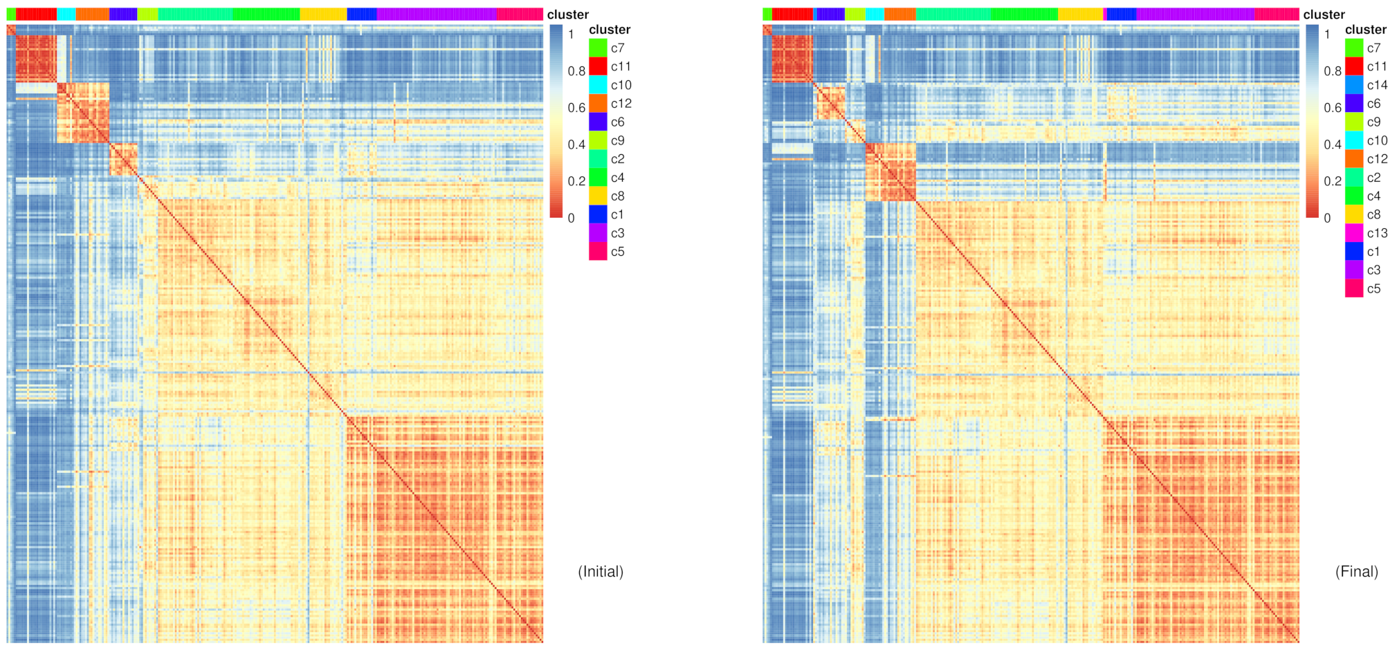
Heatmaps
The remainder of the plots are heatmaps derived from k-medoids clustering, showing the similarity between clusters for both the initial clustering and the final (post outlier detection) clustering.
The k-medoids algorithm relates to the k-means algorithm of clustering, by which
Initialise:
A value of k is chosen, e.g k=3.
k points are chosen at random in the dataset (or initialised in some rational way)
Step:
Each datapoint in the dataset is assigned to the closest k point using some distance metric.
The mean (or in this case, the median) of all points assigned to a specific k point are computed for each k point.
The k-points take on the new position of the mean (or median) values just computed
Repeat Step until convergence reached or after N number of iterations
In terms of single-cell data, for G genes, each datapoint is a G-dimensional cell. The distances between cells are computed using a given metric, and the k points are G-dimensional points indicating the centre of cluster. The k points are then updated for each iteration of the algorithm.
Question
Why use G dimensions?
Why not use 2 dimensions as given in the graphic above?
Using 2 dimensions will not capture all the variability in the data, and so the clustering will be based on whatever those 2 chosen dimensions are biased towards.
For example, if we performed a PCA first on the data and used only the first two (most variable) components of the data to perform clustering upon, we might be clustering cells based on cell-cycle variation which might be stronger than the actual biological signal that is perhaps hidden away in the higher PCA components.
Figure 10: RaceID Heatmaps for initial and final clusters
The difference shown between the initial and final clustering is sometimes subtle depending which of the clusters the new clusters have been extracted from.
Question
Which new clusters have been added?
From which cells are these new clusters derived from?
c13 and c14
c13 appears between c8 and c1, suggesting that the cells in c13 share a closer similarity to the cells in these clusters, which they were most likely extracted from. The other new cluster c14 is between c11 and c6, suggesting similar points of extraction.
All the following plots are heatmaps for the individual genes expressed in each cluster.
Figure 11: RaceID Individual (final) heatmaps for the top 10 significant genes in clusters 1 to 4
The top 10 defining genes from each cluster (above only c1-c4 are shown) give us an idea of how unique these genes are to the cluster.
Question
Which clusters are Gstm3, St3gal4, and Gna11 highly expressed in?
Where is Eef1a1 expressed?
Which cluster is poorly defined?
(Top-Left Heatmap) Gstm3, St3gal4, and Gna11 are highly expressed in c1 and c6
Eef1a1 is highly expressed everywhere, and so is not a very differentially expressed gene.
c4 appears to be a not so well-defined cluster with no genes specifically bound to it.
Visualising All Clusters
The previous section produced plots that spoke about the quality of the clustering without really showing us the clusters projected into an understandable 2D space. To perform this, we must feed the clustered data into the cluster inspection tool.
Hands On: Task description
Cluster Inspection using RaceID ( Galaxy version 0.2.3+galaxy0) with the following parameters:
param-file“Input RaceID RDS”: outrdat (output of Clustering using RaceIDtool)
“Plot All Clusters?”: Yes
“Perform Subset Analysis?”: No
“Examine Genes of Interest”: No
“Differential Gene Testing”: No
Comment
This tool can perform multiple different modes of inspection upon clustered scRNA data, and users are encouraged to explore the different modes.
The main issue with visualising this data is that as before, we have C cells that serve as our observations which are described by G genes. Representing G dimensional data in the 2 or 3 dimensional plots that we are more familiar falls under the problem of dimensional reduction.
Figure 12: Reducing a set of 4 observations from 3D to 2D space, whilst approximating the 3D relationships
Dimension reduction aims to preserve the distances and relationship of the higher dimensional (G-dimensional) data in a lower dimensional (usually 2D) space.
Preserving these higher dimensional distances in lower dimensional space is a complex and ongoing challenge in computer science, but there are various commonly-used methods such as PCA and tSNE often encountered in single cell RNA-seq datasets. For more information, see the box below.
PCA (Principle Component Analysis)
This linearly separates the N-dimensional data into N distinct components (or ‘axes’) of variability, sorted in descending order of variability (i.e. the first component explains most of the variation in the data, the second component contributes the second most amount of variation in the data, etc). For more information on how these components are derived, see Eigendecomposition of a matrix.
PCA has the benefit of being deterministic, uncostly to implement, and usually good enough to find clear differences in the data if the data is not complex.
PCA rests on the assumption that each of its N components are independent of one another, but this is often rarely the case and data usually exhibits more complexity than that of a linearly separable dataset. In these situations, tSNE outshines PCA, by modelling a more complex relationship between datapoints, and often produces better looking plots with more clearly defined clusters. This is especially the case in single-cell RNA-seq data which tends to describe a continuous blend of cell phenotypes, instead of discrete rigidly-defined types.
Force-Directed Graphs
These graphs can be better thought of as particle simulations, instead of performing any dimensional reduction, since all that is required is a connected graph. Forces are added to the connections between the nodes on the graph based on the strength of the connection, and then the whole system simulates the interplay of these forces for a number of iterations or until the system comes to rest. In general, these tend to yield much more nicely separated plots than tSNE, but it is not always the case and so it is always good practice to compare both force-directed and tSNE plots.
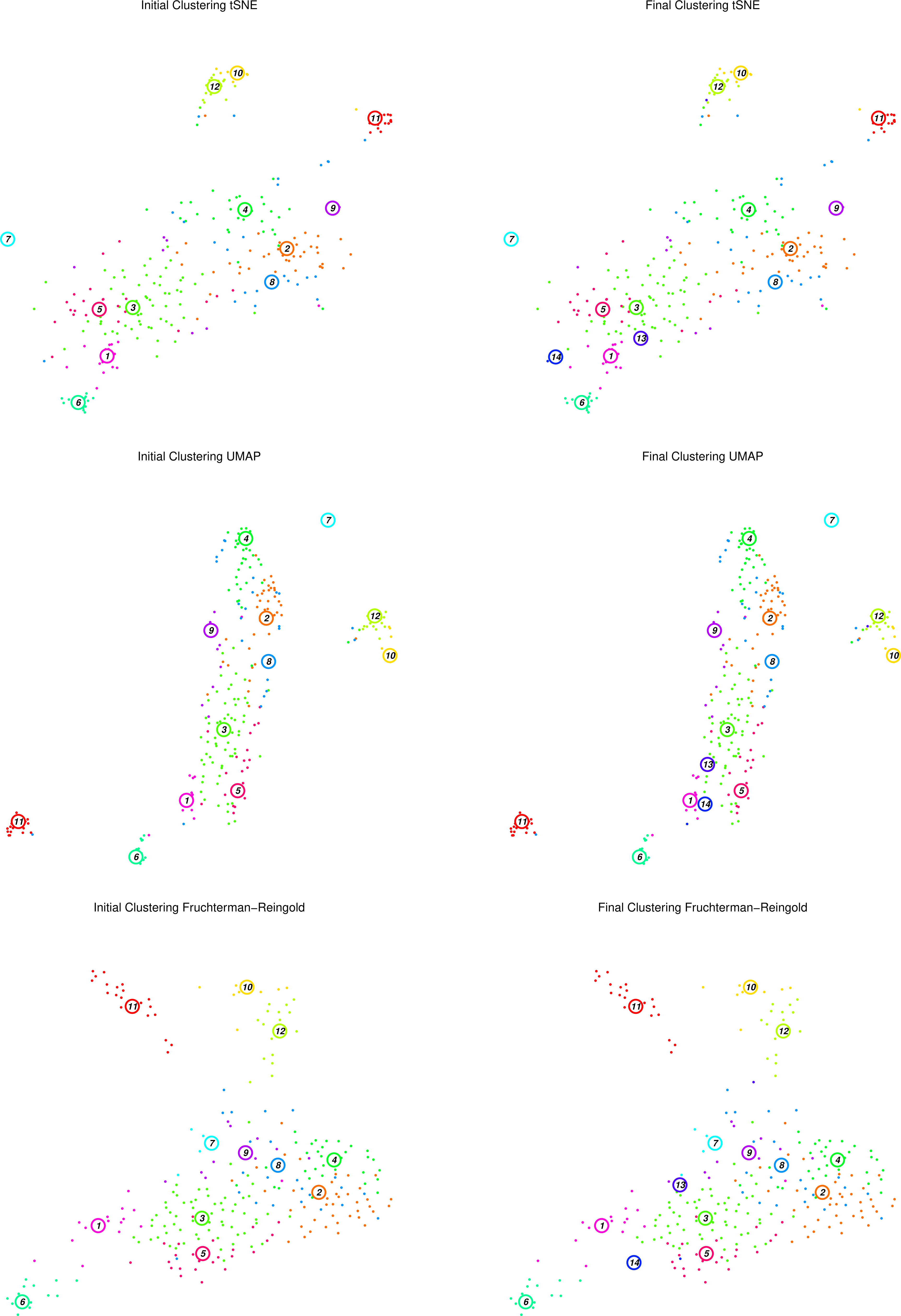
RaceID makes use of tSNE and force-directed (Fruchterman-Reingold) graph layouts to space the clusters in a visually meaningful manner to show the separation and relative proximity of clusters to one another.
Figure 13: RaceID Initial and Final clusters using tSNE, UMAP and F-R projections
The figure above displays the initial (left top/bottom) clusters detected during the clustering stage, as well as the final (right top/bottom) clusters determined during the outlier detection stage, projected using tSNE and Fruchterman-Rheingold graph layouts.
Question
What has changed between the initial and final plots?
Which clusters appear to be well defined? Are they consistent between projections?
Does this agree with the heatmaps we have seen previously?
Two extra clusters are added in the final plots c13 and c14
For example, c11 appears to be an isolated well-defined cluster of cells, distinct in both projections. At the edge of the main cluster body in both projections lies c1, but seems to be in closer proximity to c13 in the tSNE map than in the F-R layout. In both projections, c2, c3, and c4 are large noisy clusters, but c2 and c4 appear to be closer to one another in the F-R layout.
c1 was better defined by a smaller set of genes than c2, c3, or c4, which listed less differentially expressed genes as their most significant genes.
Is this expected?
One pervasive thought when analysing single-cell RNA data, is “is this actually good clustering?”
To answer this question, we must understand the nature of the data which does contain clear cell type phenotypes, but that these cell phenotypes are driven by continuous cell-cycle and cell developmental processes. As a result it is quite normal to see clusters ‘blending’ into one another, since these suggest intermediate cell types that are transitioning from one cell type to another.
Figure 14: The continuous phenotypes along a red blood cell development trajectory
The gene expression profile for Reticulocytes is distinct from the gene expression profile for the mature Red Blood Cells that they will become, but the cells that are actually undergoing this short-lived transition from Reticulocyte to Red Blood Cell will not fit neatly into the two aforementioned gene expression profiles, instead having their own profile which lies somewhere in between.
As a result it is often false to think of cell clustering as an exercise in classification, but better to be thought of as a desire to find the relatedness between expression profiles. A helpful visual example of this is to not think of assigning cells to different disconnected ‘peaks’ of expression, but to place cells along an expression peak landscape that describes not only which expression profile they resemble the most, but along which gradient (or development trajectory) they adhere to, allowing transient cell types to be better assigned.
Figure 15: (Above) Cells assigned to discrete profiles, compared to (Below) Cells placed along a continuous expression profile landscape.
The clustering of cells with single-cell RNA-seq data, is therefore not a classification problem, but a manifold detection one, where the manifold ultimately describes the topology of the data, and allows us to see relatedness between clusters.
Individual Cluster Inspection
To really understand the dynamics in the shifting profiles of gene expressions between different clusters, it is often useful to see specifically which genes are differentially expressed, and which clusters and cells they align to or define the most.
There are three ways to do this in RaceID:
MA Plot
Perform a pairwise comparison between two clusters (or two sets of clusters) to see specifically which genes are differentially expressed between them.
Subset Cell Analysis
If the cell headers have names that contain information prior to the clustering about the different cell phenotypes, then it might be interesting to see if the cells do cluster as expected.
Specific Expression Plots
It may be of interest to look at how specific genes which may be markers for a cell type are expressed across different clusters, with the expectation that they are localised to a specific cluster depending on how specific the marker is.
Differential Gene Analysis Between Two Clusters
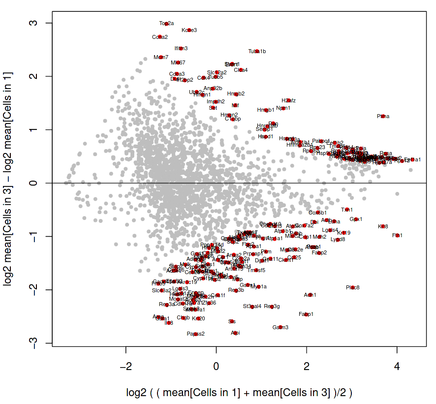
We will generate an MA Plot between the two clusters, which looks at the differences between two samples by comparing the M (log ratio) against the A (mean average) of the sets.
Here we will compare how the cells in cluster 1 are differentially expressed compared to the cell of cluster 3.
Hands On: MA plot
Cluster Inspection using RaceID ( Galaxy version 0.2.3+galaxy0) with the following parameters:
param-file“Input RaceID RDS”: outrdat (output of Clustering using RaceIDtool)
Figure 16: RaceID MA plot of cells in cluster 1 and cluster 3
The genes shown as grey dots are not labelled because they are not so differentially expressed between the two clusters, but the genes as labelled red dots on the fringes do display significant variability between the clusters.
Question
How do we interpret this plot?
Is Gstm3 (at position 1.5, -2.7 on the MA plot) more significantly differentially expressed than Ptma (at position 3.6, 1.2)?
Interpretation of plot:
The vertical axis displays the difference between cluster 3 and cluster 1, where the total counts of a gene in cluster 3 are subtracted by the total counts of a gene in cluster 1. Therefore, a gene which is in the negative portion of the vertical axis has more expression in cluster 1.
The horizontal axis displays the average expression of a gene in both clusters, and so serves as a yardstick to estimate how expressive that gene is overall.
Gstm3 has a lower average expression in both clusters, than Ptma which is higher on the horizontal axis. However, Gstm3 is expressed significantly more in Cluster 1, whereas Ptma is expressed only slightly more in Cluster 3. Overall, Gstm3 is more differentially expressed than Ptma, and is up-regulated in Cluster 3, although with fewer total mRNA counts.
Differential Gene Expression Across All Clusters
We will now look at some genes of interest to see how prevalent or unique they are across clusters. Usually known marker genes are used to identify clusters by their cell type and not just a number, but any gene of interest can be used if it is believed to characterise a cluster of cells.
Here we will look at the combined expression of Gstm3, St3gal4, and Gna11 which all had adjusted P-values of less than \(1 \cdot 10^{-15}\) in cluster 1.
Hands On: Task description
Cluster Inspection using RaceID ( Galaxy version 0.2.3+galaxy0) with the following parameters:
param-file“Input RaceID RDS”: outrdat (output of Clustering using RaceIDtool)
Figure 17: RaceID Expression plot of genes of interest across different cells.
The above figure shows where the combined expression of Gstm3, St3gal4, and Gna11 is centred, which from the tSNE plot (top-left) appears to be concentrated in cluster 6. The log expression plot (top-right) changes the scale so that lesser expression in other clusters is still visible. The bottom images provide the same information but using the F-R layout.
Question
Observe the above expression plot and the clustering plot generated during the “Visualising All Clusters” step.
Are these genes (the top 3 DE genes from cluster 1) expressed where we expect them to be?
If you would like to view two or more datasets at once, you can use the Window Manager feature in Galaxy:
Click on the Window Manager icon galaxy-scratchbook on the top menu bar.
You should see a little checkmark on the icon now
Viewgalaxy-eye a dataset by clicking on the eye icon galaxy-eye to view the output
You should see the output in a window overlayed over Galaxy
You can resize this window by dragging the bottom-right corner
Viewgalaxy-eye a second dataset from your history
You should now see a second window with the new dataset
This makes it easier to compare the two outputs
Repeat this for as many files as you would like to compare
You can turn off the Window Managergalaxy-scratchbook by clicking on the icon again
They appear to overlap c6 which is in close proximity to c1. There are two reasons why this might be the case:
c1 is a small cluster and noisy cluster surrounded by more stably defined neighbours.
The three genes are more differentially expressed in c1 than in c6, but they are more highly expressed in c6. That is, their expression is more significant in c1 compared to the rest of the genes in that cluster.
Trajectory and Lineage Analysis
It was mentioned previously that the clusters displayed are not discrete entities, but are related through some continuous topology as inferred by intermediate cell types.
StemID is a tool (part of the RaceID package) that makes use of this topology to derive a hierarchy of these cell types by constructing a cell lineage tree, rooted at the cluster(s) believed to best describe multipotent progenitor stem cells, and terminating at the clusters which describe more mature cell types. Cell trajectories are identified as a sequence of links between the medoids of different clusters, where the links between clusters are assigned scores that reflect the level of multipotency of the cell type indicated by the cluster.
Computing the Lineage Tree
Hands On
Lineage computation using StemID ( Galaxy version 0.2.3+galaxy0) with the following parameters:
param-file“Input RDS”: outrdat (output of Clustering using RaceIDtool)
In “Compute transcriptome entropy of each cell”:
“Use Defaults?”: Yes
In “Compute Cell Projections for Randomised Background Distribution”:
“Use Defaults?”: Yes
In “StemID2 Lineage Graph”:
“Use Defaults?”: Yes
Comment
This tool has three main functions:
Estimate the entropy (variability) of a cell
Estimate links/trajectories between clusters of cells
Figure 18: StemID Lineage Tree and Branches of significance.
(Top-Left) Minimum spanning tree showing most likely connections between clusters
(Top-Right) Minimum spanning tree with projected time series
(Bottom-Left) Significance between clusters
(Bottom-Right) Link scores between cluster-cluster pairs
(Top-Left) A minimum spanning tree that summarises the most likely connections between clusters.
(Top-Right) The same tree but with cells projected along the links given by StemID.
Ordering the cells along each link in such a way to suggest a time series, or pseudo-time analysis of each link. By ordering the cells by lineage pseudo-time we can trace the up/down regulation of a gene as discrete time points. The interval between each time point is hard to accurately determine, but the order of events is still important.
(Bottom-Left) The degree of significance between clusters, with:
Node Colour, indicating the level of significance between clusters
Blue: Higher level of cluster entropy (associated with progenitor cell types)
Red: Lower level of cluster entropy (associated with mature types)
Link Width, indicating the link score computed by StemID.
Indicates the number of cells in the cluster sharing the link to other.
Link Colour, indicating link significance
Red: Stronger link level
Green: Weaker link level
(Bottom-Right) The link scores between each cluster-cluster pair.
Question
Which cluster pairs are likely to be biologically significant?
Based on the above plots, which cluster is most likely to be the main progenitor of the others?
The thick red link between clusters 2-4, 3-5, and 3-1-6 are assumed to have a high level of biological significance.
On first glance, it appears that c2 would be the progenitor, due to the number of links it has and its more central position in the cluster plot.
The top of the three charts shows the number of links above a threshold that each cluster exhibits to another. The more links a cluster has, the more evidence that the cluster describes a progenitor cell type that gives rise to other more mature types.
The middle chart describes the “Delta-Entropy” which measures the variability of gene expression values within a cluster as the number of potential states (or cell types) it could produce, where clusters with more variability are less likely to be mature cell types due to the sheer “noise” that they exhibit that is to be expected of a cell type that could potentially give rise to other types.
The bottom chart is simply the top chart multiplied by the middle chart, which adds both pieces of evidence together to yield the link score.
Question
With this new information, which cluster is now most likely to be the sole progenitor?
c3 has both the most number of links as well as the most entropy that one would expect a multipotent progenitor cell type to exhibit, and therefore must be the root of the lineage tree, despite having the same number of links as c2. The more centred position of c2 in the plots has no bearing on it being the initial progenitor type.
In a similar vein to how clusters were explored individually in RaceID, we can also explore individual branches of the lineage tree to see how some genes are up or down regulated.
Specific Trajectory Lineage Analysis (StemID)
Here we will explore one branching point of interest; c3 giving rise to c1 and c5. Will we be able to find an up or down regulation of genes between these two branches?
Hands On: Comparing trajectory paths 3 to 1, and 3 to 5
Lineage Branch Analysis using StemID ( Galaxy version 0.2.3+galaxy0) with the following parameters:
param-file“Input RDS”: outrdat (output of Lineage computation using StemIDtool)
In “StemID Branch Link Examine”:
“Perform StemID?”: Yes
“Cluster Number”: 3
“Trajectory Path i, j, k”: 1,3,5
“Use Defaults?”: Yes
In “FateID Branch Link Examine”:
“Perform FateID?”: No
Comment
This tool requires trajectories to be numerical order, hence the “1,3,5” ordering.
Figure 21: (Top) StemID Minimal spanning tree of all cells projected along the links between clusters. (Bottom) StemID Heatmap of Cluster 3 cells compared to other clusters.
The vertical names along the heatmap are the cells from c3 being compared to all other clusters.
Question
How does the heatmap correlate to the minimum spanning tree (MST)?
How many c3 cells are strongly dissimilar to cells in c2, c4, c9, c8, and c11. Where are they plotted on the MST?
Many c3 cells appear to have stronger (red/orange) correlation to c2 and c4, instead of the expected c5 and c1 shown in the MST, yet c2 is further away than c5 or c1. Why is this?
Each c3 cell in the heatmap is “pulled” towards different clusters along a straight line in the MST. The degree to which it is pulled is given by the strength of the correlation of that cell to that cluster. For example cell I5d_45 has a very strong correlation to c12 and c10, and so it appears on the MST as a single (3) lying in between the c3,c12,c10 triangle.
10 c3 cells (III5d-53 to I5d-48) show negative (blue) correlation to these clusters, and these same cells have a strong correlation to c5 or c1 clusters. We can see these cells plotted along the links to these two clusters.
The c3 cells strongly correlated to c2 and c4 are also strongly correlated to c9, c8, and c11 - i.e. these cells have noisy profiles and are outliers in c3. Note that the 10 cells we identified in the previous question are not strongly correlated to other clusters except c5 and c1, meaning they have very clear trajectories.
Specific Trajectory Fate Analysis (FateID)
One final trajectory analysis that can be performed uses FateID, which tries to quantify the cell fate bias a progenitor type might exhibit to indicate which lineage path it will pursue.
Where StemID utilises a bottom-up approach by starting from mature cell types and working up to the multi-potent progenitor, FateID uses top-down approach that starts from the progenitor and works its way down.
Here we will see if we can see any pseudo-time dynamics taking place between the branching point (3 to 1, and 3 to 5) that we explored previously.
Hands On
Lineage Branch Analysis using StemID ( Galaxy version 0.2.3+galaxy0) with the following parameters:
param-file“Input RDS”: outrdat (output of Lineage computation using StemIDtool)
In “StemID Branch Link Examine”:
“Perform StemID?”: No
In “FateID Branch Link Examine”:
“Perform FateID?”: Yes
“Cells from Clusters”: 1,3,5
“Use Defaults?”: Yes
“Perform Additional FateID Analysis with Self-Organised Map?”: No
The heatmaps generated depict the same data, but at different “heat” scales to better colourise the map. The genes here are not genes, but are gene expression modules, which can be interpreted as gene motifs that are present in both c1 and c5, but at different levels of expression.
Question
To which trajectory are gene modules 1-17 up regulated?
Do modules 18-40 exhibit a similar pattern?
We can see a significant up-regulation in the expression of the 1-17 modules along the 3 to 1 trajectory, which does not exist in the 3 to 5 trajectory.
The 18-40 modules are down-regulation in the 3 to 1 trajectory, and constant expression along the 3 to 5 trajectory.
Conclusion
In this tutorial we have learned to filter, normalise, and cluster cells from heterogeneous single-cell RNA-seq data. We have explored the expression of marker genes and performed a differential gene expression analysis between two sets of clusters. We have also constructed a lineage tree from these clusters, and analysed different branching points of interest to infer a pseudo-time ordering of cells as determined by the regulation of their genes.
The steps of this workflow can be found in the related workflow.
All steps of the workflow have produced an R Data object (RDS) that serves as an input into the next step, but these objects can also be loaded into an R environment and analysed using any desired library.
This tutorial is part of the https://singlecell.usegalaxy.eu portal (Tekman et al. 2020).
You've Finished the Tutorial
Please also consider filling out the Feedback Form as well!
Key points
Clustering single-cell RNA-seq data is often noisy
RaceID can be used to cluster cells based on the their gene expression profiles
StemID describes a hierarchical relationship between clusters to find multipotent progenitor stem cells to provide an understanding of cell development
FateID predicts the potential lineages that cells within specific clusters are inclined towards
Frequently Asked Questions
Have questions about this tutorial? Have a look at the available FAQ pages and support channels
Further information, including links to documentation and original publications, regarding the tools, analysis techniques and the interpretation of results described in this tutorial can be found here.
References
Grün, D., M. J. Muraro, J.-C. Boisset, K. Wiebrands, A. Lyubimova et al., 2016 De Novo Prediction of Stem Cell Identity using Single-Cell Transcriptome Data. Cell Stem Cell 19: 266–277. 10.1016/j.stem.2016.05.010
Did you use this material as an instructor? Feel free to give us feedback on how it went.
Did you use this material as a learner or student? Click the form below to leave feedback.
Hiltemann, Saskia, Rasche, Helena et al., 2023 Galaxy Training: A Powerful Framework for Teaching! PLOS Computational Biology 10.1371/journal.pcbi.1010752
Batut et al., 2018 Community-Driven Data Analysis Training for Biology Cell Systems 10.1016/j.cels.2018.05.012
@misc{single-cell-scrna-raceid,
author = "Mehmet Tekman and Alex Ostrovsky",
	title = "Downstream Single-cell RNA analysis with RaceID (Galaxy Training Materials)",
	year = "",
	month = "",
	day = "",
	url = "\url{https://training.galaxyproject.org/training-material/topics/single-cell/tutorials/scrna-raceid/tutorial.html}",
	note = "[Online; accessed TODAY]"
}
@article{Hiltemann_2023,
	doi = {10.1371/journal.pcbi.1010752},
	url = {https://doi.org/10.1371%2Fjournal.pcbi.1010752},
	year = 2023,
	month = {jan},
	publisher = {Public Library of Science ({PLoS})},
	volume = {19},
	number = {1},
	pages = {e1010752},
	author = {Saskia Hiltemann and Helena Rasche and Simon Gladman and Hans-Rudolf Hotz and Delphine Larivi{\`{e}}re and Daniel Blankenberg and Pratik D. Jagtap and Thomas Wollmann and Anthony Bretaudeau and Nadia Gou{\'{e}} and Timothy J. Griffin and Coline Royaux and Yvan Le Bras and Subina Mehta and Anna Syme and Frederik Coppens and Bert Droesbeke and Nicola Soranzo and Wendi Bacon and Fotis Psomopoulos and Crist{\'{o}}bal Gallardo-Alba and John Davis and Melanie Christine Föll and Matthias Fahrner and Maria A. Doyle and Beatriz Serrano-Solano and Anne Claire Fouilloux and Peter van Heusden and Wolfgang Maier and Dave Clements and Florian Heyl and Björn Grüning and B{\'{e}}r{\'{e}}nice Batut and},
	editor = {Francis Ouellette},
	title = {Galaxy Training: A powerful framework for teaching!},
	journal = {PLoS Comput Biol}
}
Congratulations on successfully completing this tutorial!
Do you want to extend your knowledge?
Follow one of our recommended follow-up trainings:
Questions:


Open image in new tab
 Open image in new tab
 Open image in new tab
 Open image in new tab
Open image in new tab
 Open image in new tab
Open image in new tab
 Open image in new tab
Open image in new tab
 Open image in new tab
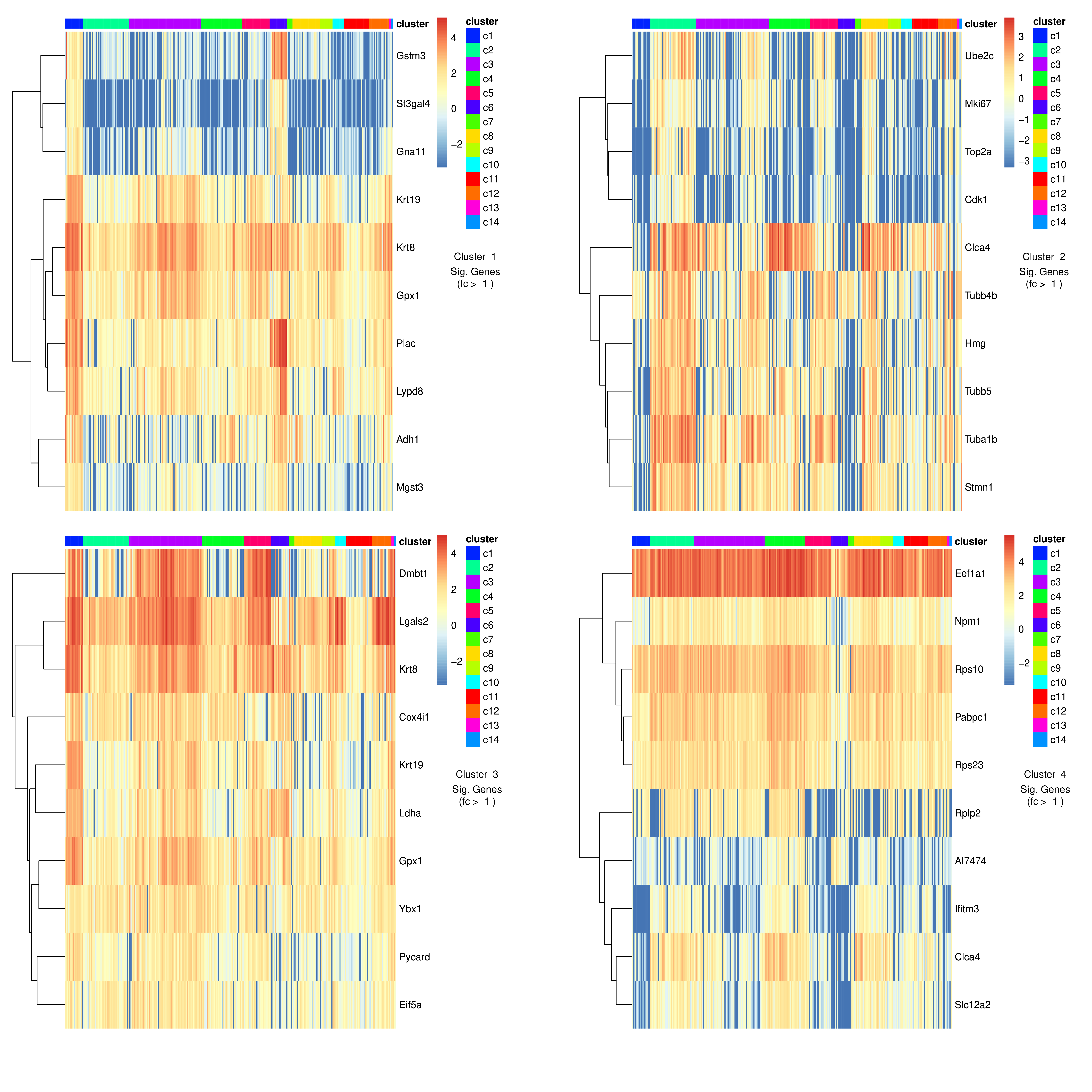 Open image in new tab
Open image in new tab
 Open image in new tab
Open image in new tab
Open image in new tab
 Open image in new tab
 Open image in new tab
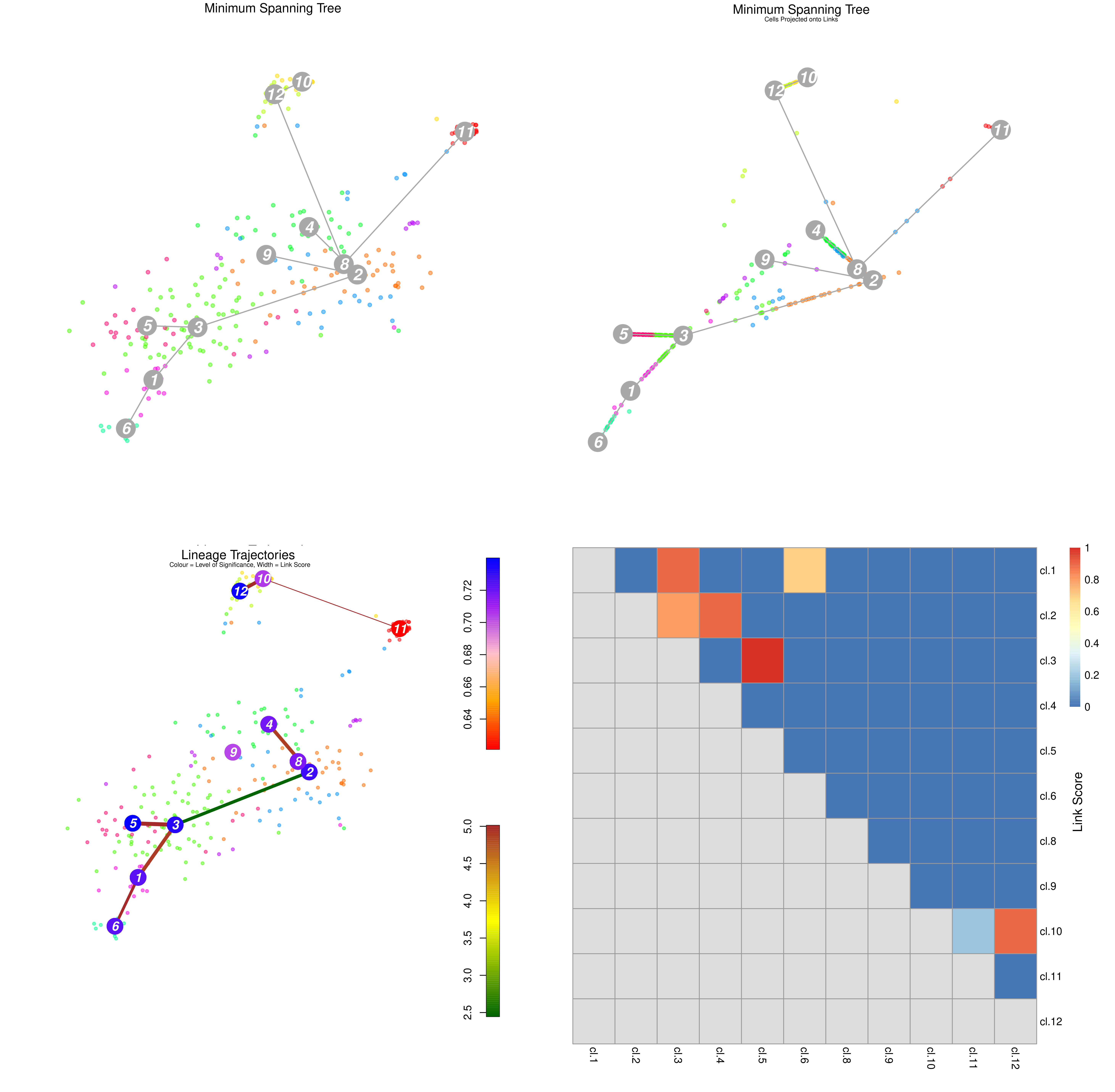 Open image in new tab
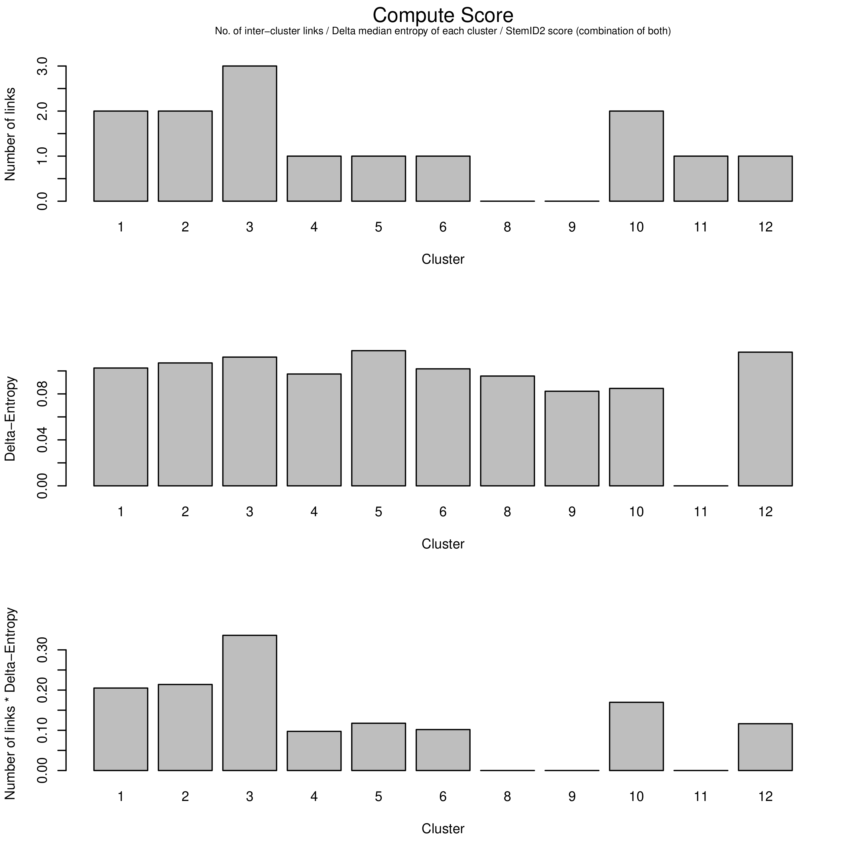 Open image in new tab
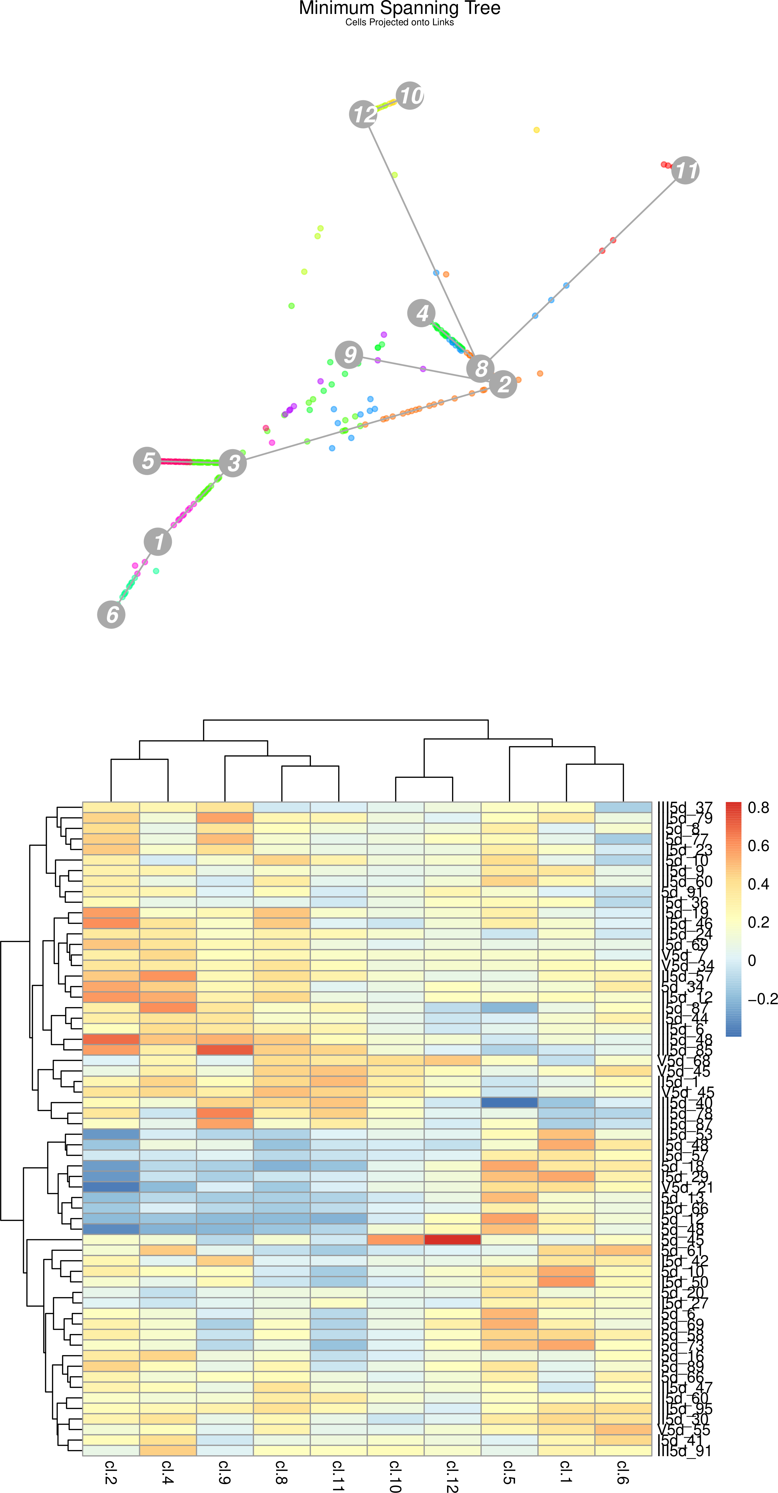 Open image in new tab
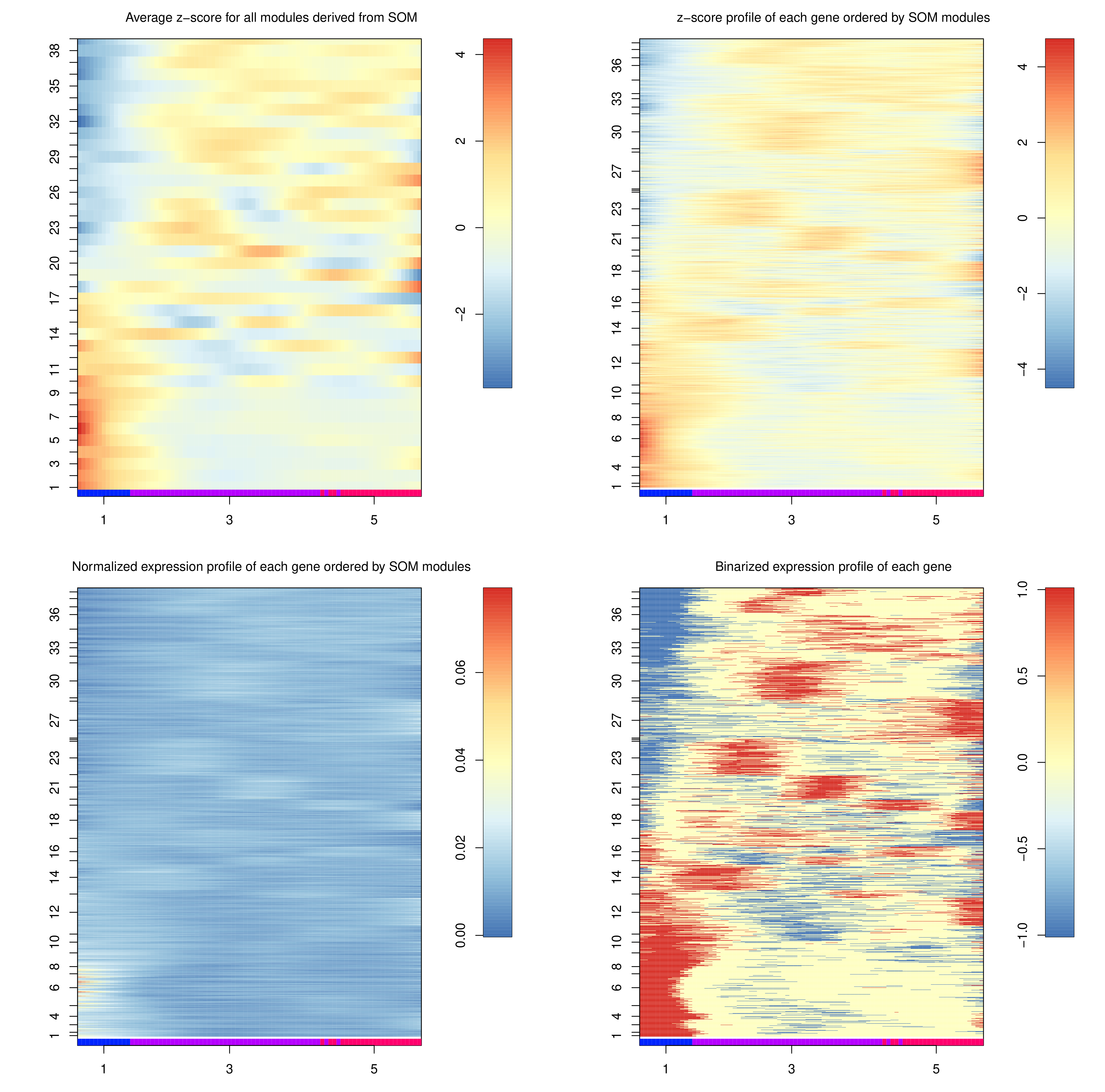 Open image in new tab
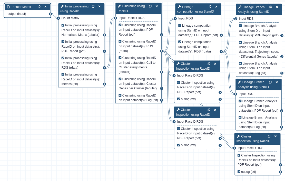 Open image in new tab