Data manipulation with Pandas
Under Development!
This tutorial is not in its final state. The content may change a lot in the next months. Because of this status, it is also not listed in the topic pages.
| Author(s) |
|
| Reviewers |
|
OverviewQuestions:
Objectives:
What is Pandas
What is a dataframe
How to access data in dataframes
Understand data manipulation in Pandas
Time estimation: 1 hourSupporting Materials:Published: Feb 20, 2024Last modification: Feb 27, 2025License: Tutorial Content is licensed under Creative Commons Attribution 4.0 International License. The GTN Framework is licensed under MITpurl PURL: https://gxy.io/GTN:T00419version Revision: 4
Best viewed in a Jupyter NotebookThis tutorial is best viewed in a Jupyter notebook! You can load this notebook one of the following ways
Run on the GTN with JupyterLite (in-browser computations)
Launching the notebook in Jupyter in Galaxy
- Instructions to Launch JupyterLab
- Open a Terminal in JupyterLab with File -> New -> Terminal
- Run
wget https://training.galaxyproject.org/training-material/topics/data-science/tutorials/gnmx-lecture6/data-science-gnmx-lecture6.ipynb- Select the notebook that appears in the list of files on the left.
Downloading the notebook
- Right click one of these links: Jupyter Notebook (With Solutions), Jupyter Notebook (Without Solutions)
- Save Link As..
SARS-CoV-2 as a research problem
To learn about pandas we will use SARS-CoV-2 data. Before actually jumping to Pandas let’s learn about the coronavirus molecular biology.
The following summary is based on these publications:
Genome organization
All coronaviruses contain non-segmented positive-strand RNA genome approx. 30 kb in length. It is invariably 5’-leader-UTR-replicase-S-E-M-N-3’UTR-poly(A). In addition, it contains a variety of accessory proteins interspersed throughout the genome (see Fig. below; (From Fehr and Perlman:2015)).
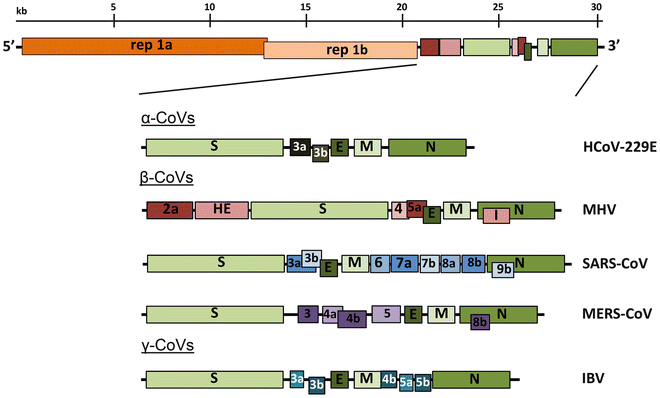 Open image in new tab
The long replicase gene encodes a number of non-structural proteins (nsps) and occupies 2/3 of the genome. Because of -1 ribosomal frameshifting within ORFab approx. in 25% of the cases polyprotein pp1ab is produced in place of pp1a. pp1a encodes 11 nsps while pp1ab encodes 15 (Fig. below from Sola:2015).
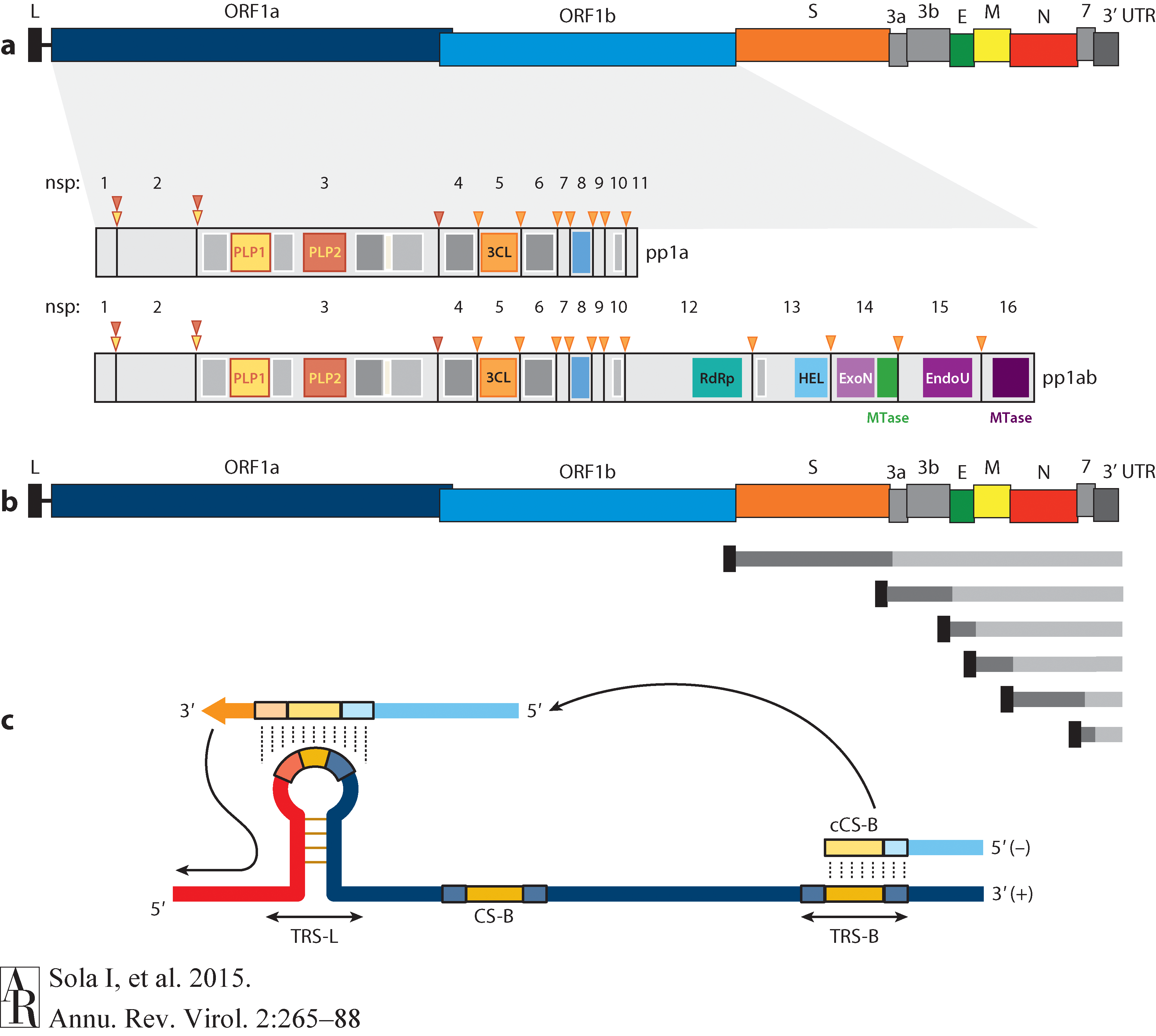 Open image in new tab
Virion structure
Coronavirus is a spherical particle approx. 125 nm in diameter. It is covered with S-protein projections giving it an appearance of solar corona - hence the term coronavirus. Inside the envelope is a nucleocapsid that has helical symmetry far more typical of (-)-strand RNA viruses. There are four main structure proteins: spike (S), membrane (M), envelope (E), and nucleocapsid (N; Fig. below Masters:2006):
 Open image in new tab
Mature S protein is a trimer of two subunits: S1 and S2. The two subunits are produced from a single S-precursor by host proteases (see Kirchdoerfer:2016; this however is not the case for all coronaviruses such as SARS-CoV). S1 forms the receptor-binding domain, while S2 forms the stalk.
M protein is the most abundant structural component of the virion and determines its shape. It possibly exists as a dimer.
E protein is the least abundant protein of the capsid and possesses ion channel activity. It facilitates the assembly and release of the virus. In SARS-CoV it is not required for replication but is essential for pathogenesis.
N proteins form the nucleocapsid. Its N- and C-terminal domains are capable of RNA binding. Specifically, it binds to transcription regulatory sequences and the genomic packaging signal. It also binds to nsp3
and M protein possible tethering viral genome and replicase-transcriptase complex.
Entering the cell
Virion attaches to the cells as a result of interaction between S-protein and a cellular receptor. In the case of SARS-CoV-2 (as is in SARS-CoV) angiotensin converting enzyme 2 (ACE2) serves as the receptor binding to C-terminal portion of S1 domain. After receptor binding S protein is cleaved at two sites within the S2 subdomain. The first cleavage separates the receptor-binding domain of S from the membrane fusion domain. The second cleavage (at S2’) exposes the fusion peptide. The SARS-CoV-2 is different from SARS-CoV in that it contains a furin cleavage site that is processed during viral maturation within endoplasmatic reticulum (ER; see Walls:2020). The fusion peptide inserts into the cellular membrane and triggers joining on the two heptad regions with S2 forming an antiparallel six-helix bundle resulting in fusion and release of the genome into the cytoplasm (Fig. below from Jackson:2022.
 Open image in new tab
Replication
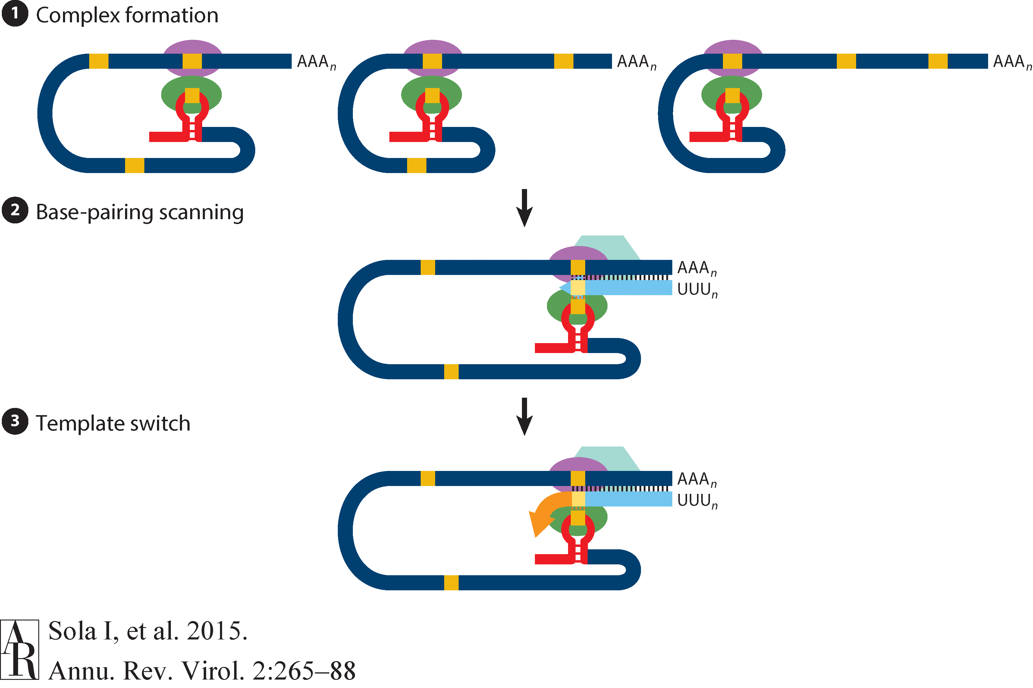
The above figure shows that in addition to the full length (+)-strand genome there is a number of (+)-strand subgenomic RNAs corresponding to 3’-end of the complete viral sequence. All of these subgenomic RNAs (sgRNAs) share the same leader sequence that is present only once at the extreme 5’-end of the viral genome. These RNAs are produced via discontinuous RNA synthesis when the RNA-dependent RNA-polymerase (RdRp) switches template:
☝ Model for the formation of genome high-order structures regulating N gene transcription. The upper linear scheme represents the coronavirus genome. The red line indicates the leader sequence in the 5′ end of the genome. The hairpin indicates the TRS-L. The gray line with arrowheads represents the nascent negative-sense RNA. The curved blue arrow indicates the template switch to the leader sequence during discontinuous transcription. The orange line represents the copy of the leader added to the nascent RNA after the template switch. The RNA-RNA interactions between the pE (nucleotides 26894 to 26903) and dE (nucleotides 26454 to 26463) and between the B-M in the active domain (nucleotides 26412 to 26421) and the cB-M in the 5′ end of the genome (nucleotides 477 to 486) are represented by solid lines. Dotted lines indicate the complementarity between positive-strand and negative-strand RNA sequences. Abbreviations: AD, active domain secondary structure prediction; B-M, B motif; cB-M, complementary copy of the B-M; cCS-N, complementary copy of the CS-N; CS-L, conserved core sequence of the leader; CS-N, conserved core sequence of the N gene; dE, distal element; pE, proximal element; TRS-L, transcription-regulating sequence of the leader (From Sola:2015).
Furthermore, Sola:2015 suggests the coronavirus transcription model in which transcription initiation complex forms at the 3’-end of (+)-strand genomic RNA:
 Open image in new tab
How virus is screened
Two approaches: (1) RNAseq and (2) amplicons
RNAseq approach requires a large sample quantity, but is suitable for detecting low-frequency variants. Ampliconic approaches are useful for samples containing a small fraction of viral RNA and are by far the most widely used (From NEB):
 Open image in new tab
Pandas!
This is an aggregated tutorial relying on material from the following fantastic sources:
- Justin Bois. It contains modified training datasets and adopts content to Colab environment.
- BIOS821 course at Duke
- Pandas documentation
Pandas (from “Panel Data”) is an essential piece of scientific (and not only) data analysis infrastructure. It is, in essence, a highly optimized library for manipulating very large tables (or “Data Frames”).
Today we will be using a single notebook that explains the basics of this powerful tool:
Pandas learning resources
- Getting started - official introduction from Pandas.
- Data Science Tools - Data Science for Biologists from Duke University.
- Data Carpentry - a collection of lessons à la Software Carpentry.
# Pandas, conventionally imported as pd
import pandas as pd
Throughout your research career, you will undoubtedly need to handle data, possibly lots of data. The data comes in lots of formats, and you will spend much of your time wrangling the data to get it into a usable form.
Pandas is the primary tool in the Python ecosystem for handling data. Its primary object, the DataFrame is extremely useful in wrangling data. We will explore some of that functionality here and will put it to use in the next lesson.
Basics
The data set
The dataset we will be using is a subset of metadata describing SARS-CoV-2 datasets from the Sequence Read Archive.
It is obtained by going to https://www.ncbi.nlm.nih.gov/sra and performing a query with the following search terms: txid2697049[Organism:noexp].
Results are downloaded using Send to: menu selecting File and then RunInfo. Let’s get these results into this notebook:
!wget https://zenodo.org/records/10680001/files/sra_ncov.csv.gz
!gunzip -c sra_ncov.csv.gz | head
The first line contains the headers for each column. The data follow. Given the file I/O skills you recently learned, you could write some functions to parse this file and extract the data you want.
You can imagine that this might be kind of painful. However, if the file format is nice and clean like we more or less have here, we can use pre-built tools. Pandas has a very powerful function, pd.read_csv()
that can read in a CSV file and store the contents in a convenient data structure called a data frame. In Pandas, the data type for a data frame is DataFrame, and we will use “data frame” and “DataFrame” interchangeably.
Reading in data
Let’s first look at the doc string of pd.read_csv().
pd.read_csv?
Holy cow! There are so many options we can specify for reading in a CSV file. You will likely find reasons to use many of these throughout your research. For now, however, we do not need most of them.
So, let’s load in the data set. Note that even though the dataset is compressed with gzip we do not need to do anything additional - pandas magically understands and uncompresses the data while loading it into the dataframe.
df = pd.read_csv('sra_ncov.csv.gz')
The same result can be achieved directly without downloading the file first:
df = pd.read_csv('https://zenodo.org/records/10680001/files/sra_ncov.csv.gz')
We now have the data stored in a data frame. We can look at it in the Jupyter Notebook since Jupyter will display it in a well-organized, pretty way. Note that because our dataframe is big,
we only display the first five rows using head() function:
df.head()
Indexing data frames
The data frame is a convenient data structure for many reasons that will become clear as we start exploring. Let’s start by looking at how data frames are indexed. Let’s try to look at the first row.
df[0]
Yikes! Lots of errors. The problem is that we tried to index numerically by row. We index DataFrames, by columns. And no column has the name 0 in this data frame, though there could be.
Instead, you might want to look at the column with the percentage of correct face-matching tasks.
df['Run'].head()
This gave us the numbers we were after. Notice that when it was printed, the index of the rows came along with it. If we wanted to pull out a single percentage correct, say corresponding to index 4, we can do that.
df['Run'][4]
However, this is not the preferred way to do this. It is better to use .loc. This gives the location in the data frame we want.
locandilocare both methods in the Pandas library for DataFrame indexing.
loc: It is label-based indexing, meaning that you use the actual row and column labels to make selections. This means that you specify rows and columns based on their index labels. For example, df.loc[3, ‘column_name’] will select the value in the third row and the column labeled ‘column_name’.
iloc: It is integer-based indexing, where you use the integer position of the rows and columns to make selections. This means that you specify rows and columns based on their integer position. For example, df.iloc[3, 2] will select the value in the fourth row and the third column (remembering that indexing starts at 0).In summary,
locuses labels for indexing, whileilocuses integer positions.
df.loc[4, 'Run']
df.iloc[4:6]
df.iloc[4:6, [0,2,4]]
df.loc[4:6, ['Run','size_MB','LibraryStrategy']]
df.loc[4:6, 'Run':]
df.loc[4:6, 'Run':'LibrarySource']
It is also important to note that row indices need not be integers. And you should not count on them being integers. In practice, you will almost never use row indices, but rather use Boolean indexing.
Filtering: Boolean indexing of data frames
Let’s say I wanted to pull out accession numbers of runs produced by Pacific Biosciences machines (in this table such datasets are labeled as PACBIO_SMRT. I can use Boolean indexing to specify the row. Specifically, I want the row for which df['Platform'] == 'PACBIO_SMRT'. You can essentially plop this syntax directly when using .loc.
df.loc[df['Platform'] == 'PACBIO_SMRT', 'Run']
If I want to pull the whole record for that participant, I can use : for the column index.
df.loc[df['Platform'] == 'PACBIO_SMRT', :].head(10)
Now, let’s pull out all PacBio records that were obtained from Amplicon sequencing. We can again use Boolean indexing, but we need to use an & operator.
We have not covered this bitwise operator before, but the syntax is self-explanatory in the example below. Note that it is important that each Boolean operation you are doing is in parentheses because of the precedence of the operators involved.
df.loc[(df['Platform'] == 'PACBIO_SMRT') & (df['LibraryStrategy'] == 'AMPLICON'), :].head(3)
What is going on will be clearer if we set up our Boolean indexing first, as follows.
inds = (df['Platform'] == 'PACBIO_SMRT') & (df['LibraryStrategy'] == 'AMPLICON')
inds[2:6]
Notice that inds is an array (actually a Pandas Series, essentially a DataFrame with one column) of Trues and Falses. We can apply the unique function from NumPy to see how
many True and False rows we have:
import numpy as np
np.unique(inds, return_counts=True)
When we index with it using .loc, we get back rows where inds is True:
df.loc[inds, :]
df.loc[(df['Platform'] == 'PACBIO_SMRT') & (df['LibraryStrategy'] == 'AMPLICON'), :].head(3)
Calculating with data frames
The SRA data contains (sometimes) size of the run in MB (size_MB). Let’s suppose we want to consider only those run where size_MB is above 100. We might like to add a column to the data frame that specifies whether or not the corresponding run is above 100Mb. We can conveniently compute with columns. This is done element-wise.
df['size_MB'] >= 100
This tells us which run is above 100 Mb. We can simply add this back to the data frame.
# Add the column to the DataFrame
df['Over100Mb'] = df['size_MB'] >= 100

# Take a look
df.head()
df.assign(over100 = df['size_MB']>=100)
A note of assign
The assign method in the pandas library is used to add new columns to a pandas DataFrame. The method allows you to perform calculations or operations on existing columns to generate new columns without modifying the original DataFrame.
For example, you can use the assign method to add a new column that calculates the sum of two existing columns or to add a column based on a complex calculation that involves multiple columns. The method also supports adding columns based on external data sources, such as NumPy arrays or other pandas DataFrames.
Using assign method is useful because it allows you to create new columns and add them to a DataFrame in a way that is both readable and easy to maintain. The method is also chain-able, meaning you can add multiple columns in one call, making your code more concise and efficient.
A note about vectorization
Notice how applying the <= operator to a Series resulted in elementwise application. This is called vectorization. It means that we do not have to write a for loop to do operations on the elements of a Series or other array-like object. Imagine if we had to do that with a for loop.
big_runs = []
for size in df['size_MB']:
    big_runs.append(size >= 100)
This is cumbersome. The vectorization allows for much more convenient calculation. Beyond that, the vectorized code is almost always faster when using Pandas and Numpy because the looping is done with compiled code under the hood. This can be done with many operators, including those you’ve already seen, like +, -, *, /, **, etc.
Outputting a new CSV file
Now that we added the Over100Mb column, we might like to save our data frame as a new CSV that we can reload later. We use df.to_csv() for this with the index kwarg to ask Pandas not to explicitly write the indices to the file.
df.to_csv('over100Mb_data.csv', index=False)
Let’s take a look at what this file looks like.
!head over100Mb_data.csv
Tidy data
Hadley Wickham wrote a great article in favor of “tidy data.” Tidy data frames follow the rules:
- Each variable is a column.
- Each observation is a row.
- Each type of observation has its own separate data frame.
This is less pretty to visualize as a table, but we rarely look at data in tables. Indeed, the representation of data that is convenient for visualization is different from that which is convenient for analysis. A tidy data frame is almost always much easier to work with than non-tidy formats.
Also, let’s take a look at this article.
The data set
The dataset we will be using is a list of all SARS-CoV-2 datasets in Sequence Read Archive as of January 20, 2021.
It is obtained by going to https://www.ncbi.nlm.nih.gov/sra and performing a query with the following search terms: txid2697049[Organism:noexp].
Results are downloaded using Send to: menu selecting File and then RunInfo. Let’s get these results into this notebook:
df = pd.read_csv('https://zenodo.org/records/10680001/files/sra_ncov.csv.gz')
df = df[df['size_MB']> 0].reset_index(drop=True)

# Take a look
df
This data set is in tidy format. Each row represents a single SRA dataset. The properties of each run are given in each column. We already saw the power of having the data in this format when we did Boolean indexing in the last lesson.
Finding unique values and counts
How many unique sequencing platforms do we have?
df['Platform'].unique()
df['Platform'].value_counts()
Sorting
(and axes!)
Let’s start by sorting on index:
df_subset = df.sample(n=10)
df_subset
df_subset.sort_index()
df_subset.sort_index(axis = 1)
Now let’s try sorting by values:
df_subset.sort_values(by=['LibraryLayout'])
df_subset.sort_values(by=['LibraryLayout','size_MB'])
df_subset.sort_values(by=['LibraryLayout','size_MB'],ascending=[True,False])
Split-apply-combine
Let’s say we want to compute the total size of SRA runs for each BioProject. Ignoring for the second the mechanics of how we would do this with Pandas, let’s think about it in English. What do we need to do?
- Split the data set up according to the
'BioProject'field, i.e., split it up so we have a separate data set for each BioProject ID. - Apply a median function to the activity in these split data sets.
- Combine the results of these averages on the split data set into a new, summary data set that contains classes for each platform and medians for each.
We see that the strategy we want is a split-apply-combine strategy. This idea was put forward by Hadley Wickham in this paper. It turns out that this is a strategy we want to use very often. Split the data in terms of some criterion. Apply some function to the split-up data. Combine the results into a new data frame.
Note that if the data are tidy, this procedure makes a lot of sense. Choose the column you want to use to split by. All rows with like entries in the splitting column are then grouped into a new data set. You can then apply any function you want into these new data sets. You can then combine the results into a new data frame.
Pandas’s split-apply-combine operations are achieved using the groupby() method. You can think of groupby() as the splitting part. You can then apply functions to the resulting DataFrameGroupBy object. The Pandas documentation on split-apply-combine is excellent and worth reading through. It is extensive though, so don’t let yourself get intimidated by it.
Aggregation
Let’s go ahead and do our first split-apply-combine on this tidy data set. First, we will split the data set up by BioProject.
grouped = df.groupby(['BioProject'])

# Take a look
grouped
There is not much to see in the DataFrameGroupBy object that resulted. But there is a lot we can do with this object. Typing grouped. and hitting tab will show you the many possibilities. For most of these possibilities, the apply and combine steps happen together and a new data frame is returned. The grouped.sum() method is exactly what we want.
df_sum = grouped.sum()

# Take a look
df_sum
df_sum = pd.DataFrame(grouped['size_MB'].sum())
df_sum
The outputted data frame has the sums of numerical columns only, which we have only one: size_MS. Note that this data frame has Platform as the name of the row index.
If we want to instead keep Platform (which, remember, is what we used to split up the data set before we computed the summary statistics) as a column, we can use the reset_index() method.
df_sum.reset_index()
Note, though, that this was not done in-place. If you want to update your data frame, you have to explicitly do so.
df_sum = df_sum.reset_index()
We can also use multiple columns in our groupby() operation. To do this, we simply pass in a list of columns into df.groupby(). We will chain the methods, performing a groupby,
applying a median, and then resetting the index of the result, all in one line.
df.groupby(['BioProject', 'Platform']).sum().reset_index()
This type of operation is called an aggregation. That is, we split the data set up into groups, and then computed a summary statistic for each group, in this case the median.
You now have tremendous power in your hands. When your data are tidy, you can rapidly accelerate the ubiquitous split-apply-combine methods. Importantly, you now have a logical
framework to think about how you slice and dice your data. As a final, simple example, I will show you how to go start to finish after loading the data set into a data frame,
splitting by BioProject and Platform, and then getting the quartiles and extrema, in addition to the mean and standard deviation.
df.groupby(['BioProject', 'Platform'])['size_MB'].describe()
df.groupby(['BioProject', 'Platform'])['size_MB'].describe().reset_index()
import numpy as np
df.groupby(['BioProject', 'Platform']).agg({'size_MB':np.mean, 'Run':'nunique'})
Yes, that’s right. One single, clean, easy-to-read line of code. In the coming tutorials, we will see how to use tidy data to quickly generate plots.
Tidying a data set
You should always organize your data sets in a tidy format. However, this is sometimes just not possible, since your data sets can come from instruments that do not output the data in tidy format (though most do, at least in my experience), and you often have collaborators that send data in untidy formats.
The most useful function for tidying data is pd.melt(). To demonstrate this we will use a dataset describing read coverage across SARS-CoV-2 genomes for several samples.
df = pd.read_csv('https://zenodo.org/records/10680470/files/coverage.tsv.gz',sep='\t')

df.head()
Clearly, these data are not tidy. When we melt the data frame, the data within it, called values, become a single column. The headers, called variables, also become new columns.
So, to melt it, we need to specify what we want to call the values and what we want to call the variable. pd.melt() does the rest!

Image from Pandas Docs.
melted = pd.melt(df, value_name='coverage', var_name=['sample'],value_vars=df.columns[3:],id_vars=['start','end'])

melted.head()
…and we are good to do with a tidy DataFrame! Let’s take a look at the summary. This would allow us to easily plot coverage:
import seaborn as sns
sns.relplot(data=melted, x='start',y='coverage',kind='line')
sns.relplot(data=melted, x='start',y='coverage',kind='line',hue='sample')
melted.groupby(['sample']).describe()
melted.groupby(['sample'])['coverage'].describe()
To get back from melted (narrow) format to wide format we can use pivot() function.

Image from Pandas Docs.
melted.pivot(index=['start','end'],columns='sample',values='coverage')
Working with multiple tables
Working with multiple tables often involves joining them on a common key:

In fact, this can be done in several different ways described below. But first, let’s define two simple dataframes:
!pip install --upgrade pandasql
from pandasql import sqldf
pysqldf = lambda q: sqldf(q, globals())
df1 = pd.DataFrame({"key": ["A", "B", "C", "D"], "value": np.random.randn(4)})
df2 = pd.DataFrame({"key": ["B", "D", "D", "E"], "value": np.random.randn(4)})
df1
df2
Inner join

Figure from Wikimedia Commons
Using pandas merge:
pd.merge(df1, df2, on="key")
Using pysqldf:
pysqldf('select * from df1 join df2 on df1.key=df2.key')
Left join

Figure from Wikimedia Commons
Using pandas merge:
pd.merge(df1, df2, on="key", how="left").fillna('.')
Using pysqldf:
pysqldf('select * from df1 left join df2 on df1.key=df2.key').fillna('.')
pysqldf('select df1.key, df1.value as value_x, df2.value as value_y from df1 left join df2 on df1.key=df2.key').fillna('.')
Right join

Figure from Wikimedia Commons
Using pandas merge:
pd.merge(df1, df2, on="key", how="right").fillna('.')
Full join

Figure from Wikimedia Commons
Using pandas merge:
pd.merge(df1, df2, on="key", how="outer").fillna('.')
Putting it all together: Pandas + Altair
Understanding Altair
Vega-Altair is a declarative statistical visualization library for Python, based on Vega and Vega-Lite. It offers a powerful and concise grammar that enables you to quickly build a wide range of statistical visualizations. This site contains a complete set of “how-to” tutorials explaining all aspects of this remarkable package.
Importing data
First, import all the packages we need:
import pandas as pd
import altair as alt
from datetime import date
today = date.today()
Next, read a gigantic dataset from DropBox:
sra = pd.read_csv(
    "https://zenodo.org/records/10680776/files/ena.tsv.gz",
    compression='gzip',
    sep="\t",
    low_memory=False
)
This dataset contains a lot of rows:
len(sra)
Which would output:
1000000
Let’s look at the five random lines from this table (scroll sideways):
sra.sample(5)
| study_accession | run_accession | collection_date | instrument_platform | library_strategy | library_construction_protocol | |
|---|---|---|---|---|---|---|
| 2470282 | PRJEB37886 | ERR8618165 | 2022-02-03 00:00:00 | ILLUMINA | AMPLICON | nan |
| 5747352 | PRJNA686984 | SRR21294506 | 2022-07-10 00:00:00 | OXFORD_NANOPORE | AMPLICON | nan |
| 2588443 | PRJEB37886 | ERR8997118 | 2022-02-15 00:00:00 | ILLUMINA | AMPLICON | nan |
| 3662323 | PRJNA716984 | SRR16033134 | 2021-09-08 00:00:00 | PACBIO_SMRT | AMPLICON | Freed primers |
| 5298351 | PRJNA716984 | SRR20455932 | 2022-04-10 00:00:00 | PACBIO_SMRT | AMPLICON | Freed primers |
This dataset also has a lot of columns:
for _ in sra.columns: print(_)
We do not need all the columns, so let’s restrict the dataset only to columns we would need. This would also make it much smaller:
sra = sra[
    [
        'study_accession',
        'run_accession',
        'collection_date',
        'instrument_platform',
        'library_strategy',
        'library_construction_protocol'
    ]
]
Cleaning the data
The collection_date field will be useful for us to be able to filter out nonsense as you will see below. But to use it properly, we need tell Pandas that it is not just a text, but actually dates:
sra = sra.assign(collection_date = pd.to_datetime(sra["collection_date"]))
Let’s see what are the earliest and latest entries:
print('Earliest entry:', sra['collection_date'].min())
print('Latest entry:', sra['collection_date'].max())
Warning: Metadata is 💩😱 | Don’t get surprised here - the metadata is only as good as the person who entered it. So, when you enter metadata for you sequencing data – pay attention!!!
QuestionCan you write a statement that would show how many rows contain these erroneous dates?
sra[sra['collection_date'] == sra['collection_date'].min()]['run_accession'].nunique()
sra[sra['collection_date'] == sra['collection_date'].max()]['run_accession'].nunique()
The data will likely need a bit of cleaning:
sra = sra[
    ( sra['collection_date'] >= '2020-01-01' )
    &
    ( sra['collection_date'] <= '2023-02-16' )
]
Finally, in order to build the heatmap, we need to aggregate the data:
heatmap_2d = sra.groupby(
    ['instrument_platform','library_strategy']
).agg(
    {'run_accession':'nunique'}
).reset_index()
This will look something like this:
| instrument_platform | library_strategy | run_accession | |
|---|---|---|---|
| 0 | BGISEQ | AMPLICON | 21 |
| 1 | BGISEQ | OTHER | 1067 |
| 2 | BGISEQ | RNA-Seq | 64 |
| 3 | BGISEQ | Targeted-Capture | 38 |
| 4 | BGISEQ | WGA | 1 |
| 5 | CAPILLARY | AMPLICON | 3 |
| 6 | DNBSEQ | AMPLICON | 325 |
| 7 | DNBSEQ | OTHER | 5 |
| 8 | DNBSEQ | RNA-Seq | 64 |
| 9 | ILLUMINA | AMPLICON | 4833110 |
| 10 | ILLUMINA | OTHER | 204 |
| 11 | ILLUMINA | RNA-Seq | 34826 |
| 12 | ILLUMINA | Targeted-Capture | 14843 |
| 13 | ILLUMINA | WCS | 74 |
| 14 | ILLUMINA | WGA | 89499 |
| 15 | ILLUMINA | WGS | 59618 |
| 16 | ILLUMINA | WXS | 2 |
| 17 | ILLUMINA | miRNA-Seq | 28 |
| 18 | ION_TORRENT | AMPLICON | 108617 |
| 19 | ION_TORRENT | RNA-Seq | 75 |
| 20 | ION_TORRENT | WGA | 724 |
| 21 | ION_TORRENT | WGS | 1385 |
| 22 | OXFORD_NANOPORE | AMPLICON | 445491 |
| 23 | OXFORD_NANOPORE | OTHER | 31 |
| 24 | OXFORD_NANOPORE | RNA-Seq | 18617 |
| 25 | OXFORD_NANOPORE | WGA | 7842 |
| 26 | OXFORD_NANOPORE | WGS | 13670 |
| 27 | PACBIO_SMRT | AMPLICON | 533112 |
| 28 | PACBIO_SMRT | FL-cDNA | 11 |
| 29 | PACBIO_SMRT | RNA-Seq | 1013 |
| 30 | PACBIO_SMRT | Synthetic-Long-Read | 29 |
| 31 | PACBIO_SMRT | Targeted-Capture | 465 |
| 32 | PACBIO_SMRT | WGS | 48 |
Plotting the data
Now let’s create a graph. This graph will be layered: the “back” will be the heatmap squares and the “front” will be the numbers (see heatmap at the beginning of this page):
back = alt.Chart(heatmap_2d).mark_rect(opacity=1).encode(
    x=alt.X(
        "instrument_platform:N",
        title="Instrument"
    ),
    y=alt.Y(
        "library_strategy:N",
        title="Strategy",
        axis=alt.Axis(orient='right')
    ),
    color=alt.Color(
        "run_accession:Q",
        title="# Samples",
        scale=alt.Scale(
            scheme="goldred",
            type="log"
        ),
    ),
    tooltip=[
        alt.Tooltip(
            "instrument_platform:N",
            title="Machine"
        ),
        alt.Tooltip(
            "run_accession:Q",
            title="Number of runs"
        ),
        alt.Tooltip(
            "library_strategy:N",
            title="Protocol"
        )
    ]
).properties(
    width=500,
    height=150,
    title={
      "text":
        ["Breakdown of datasets (unique accessions) from ENA",
         "by Platform and Library Strategy"],
      "subtitle":"(Updated {})".format(today.strftime("%B %d, %Y"))
    }
)

back
This would give us a grid:

Now, it would be nice to fill the rectangles with actual numbers:
front = back.mark_text(
    align="center",
    baseline="middle",
    fontSize=12,
    fontWeight="bold",
).encode(
    text=alt.Text("run_accession:Q",format=",.0f"),
    color=alt.condition(
        alt.datum.run_accession > 200,
        alt.value("white"),
        alt.value("black")
    )
)

front
This would give us the text:

To superimpose these on top of each other we should simply do this:
back + front

You've Finished the Tutorial
Key points
Pandas are an essential tool for data manipulation
Frequently Asked Questions
Have questions about this tutorial? Have a look at the available FAQ pages and support channelsFeedback
Did you use this material as an instructor? Feel free to give us feedback on how it went.
Did you use this material as a learner or student? Click the form below to leave feedback.

Citing this Tutorial
- Anton Nekrutenko, Data manipulation with Pandas (Galaxy Training Materials). https://training.galaxyproject.org/training-material/topics/data-science/tutorials/gnmx-lecture6/tutorial.html Online; accessed TODAY
- Hiltemann, Saskia, Rasche, Helena et al., 2023 Galaxy Training: A Powerful Framework for Teaching! PLOS Computational Biology 10.1371/journal.pcbi.1010752
- Batut et al., 2018 Community-Driven Data Analysis Training for Biology Cell Systems 10.1016/j.cels.2018.05.012
Congratulations on successfully completing this tutorial!@misc{data-science-gnmx-lecture6, author = "Anton Nekrutenko", title = "Data manipulation with Pandas (Galaxy Training Materials)", year = "", month = "", day = "", url = "\url{https://training.galaxyproject.org/training-material/topics/data-science/tutorials/gnmx-lecture6/tutorial.html}", note = "[Online; accessed TODAY]" } @article{Hiltemann_2023, doi = {10.1371/journal.pcbi.1010752}, url = {https://doi.org/10.1371%2Fjournal.pcbi.1010752}, year = 2023, month = {jan}, publisher = {Public Library of Science ({PLoS})}, volume = {19}, number = {1}, pages = {e1010752}, author = {Saskia Hiltemann and Helena Rasche and Simon Gladman and Hans-Rudolf Hotz and Delphine Larivi{\`{e}}re and Daniel Blankenberg and Pratik D. Jagtap and Thomas Wollmann and Anthony Bretaudeau and Nadia Gou{\'{e}} and Timothy J. Griffin and Coline Royaux and Yvan Le Bras and Subina Mehta and Anna Syme and Frederik Coppens and Bert Droesbeke and Nicola Soranzo and Wendi Bacon and Fotis Psomopoulos and Crist{\'{o}}bal Gallardo-Alba and John Davis and Melanie Christine Föll and Matthias Fahrner and Maria A. Doyle and Beatriz Serrano-Solano and Anne Claire Fouilloux and Peter van Heusden and Wolfgang Maier and Dave Clements and Florian Heyl and Björn Grüning and B{\'{e}}r{\'{e}}nice Batut and}, editor = {Francis Ouellette}, title = {Galaxy Training: A powerful framework for teaching!}, journal = {PLoS Comput Biol} }