View markdown source on GitHub

ChIP-seq data analysis

Contributors

Questions

Objectives

last_modification Published: Sep 17, 2018
last_modification Last Updated: Jul 27, 2021

ChIP-seq

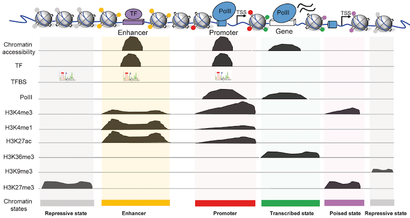
.image-75[A complicated figure showing a set of nucleosomes at the top with the following regions appearing to be exposed to sequencing: enhancer, promoter, gene, and tss regions. several charts appear below, chromatin accessibility showing broad peaks around the enhancer, promoter, and gene. the transcription factor chart shows peaks around enhancer and promoter. A line labelled TFBS shows sequences in repressive state (the nucleosome regions), enhancer, and promoter. The PollI track shows peaks below promoter and gene. Then several organisms labelled things like H3K4me1, H3K36me3 show various peaks along the regions of repressive state, enhancer, promoter, transcribed state (the gene) and poised state (the transcription start site.).]


Generating ChIP-seq data

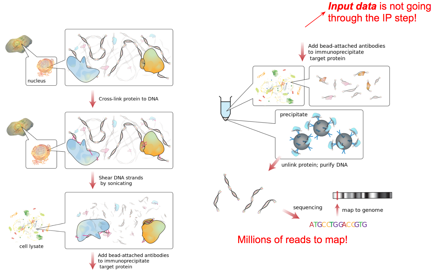
A diagram illustrating the principles of Chromatin Immunoprecipitation Sequencing (ChIP-sequencing), where the location of binding by a specific protein to DNA is investigated. DNA from the nucleus is taken, and cross-linked to protein DNA. This is then sheared by sonication, and the cells are lysed. Bead-attached antibodies are added to immunoprecipitate the target protein. A large red callout says input data is NOT going through the Immunoprecipitation step. The resulting beads with bound protein are sequenced and mapped to the genome. Another bred text says millions of reads to map.

Source: Wikipedia


ChIP vs Input

A cartoon of sequencing shows a line labelled genome. Input reads shown below map along the entire genome. ChIP reads map in broad peaks, along only specific regions.


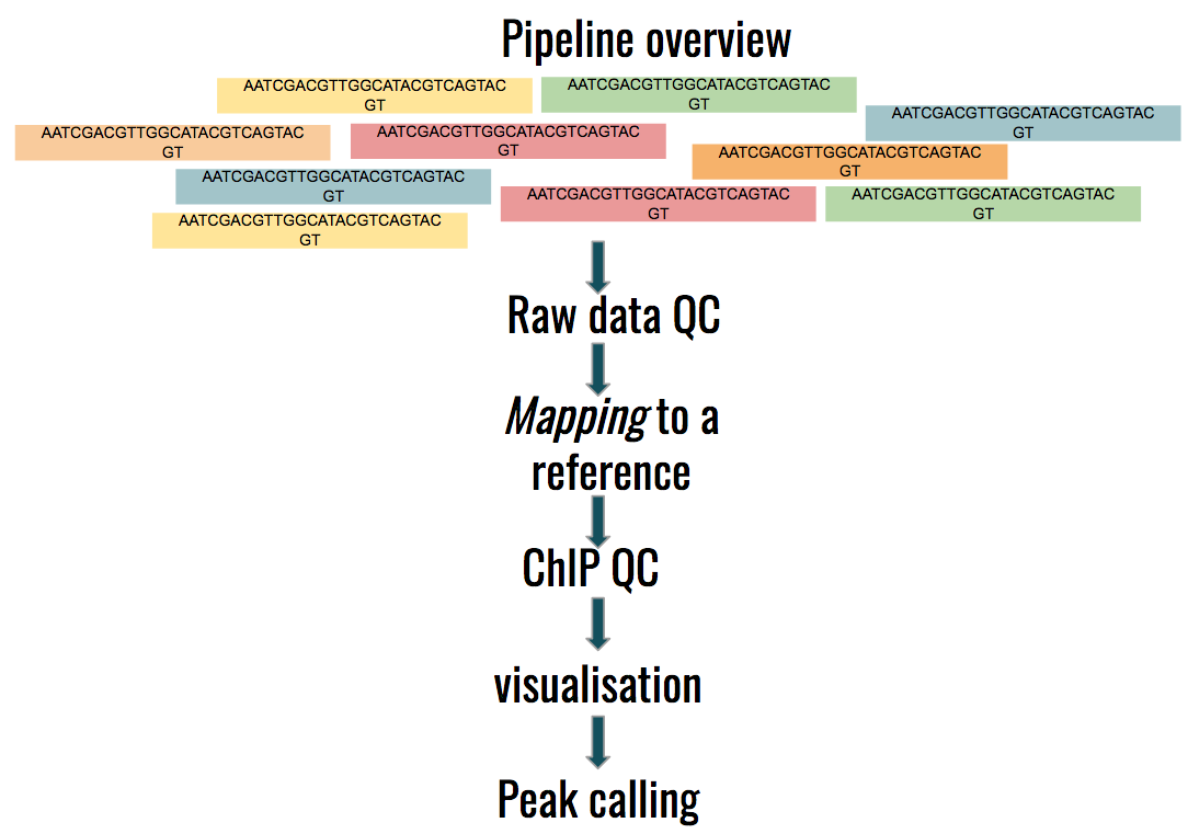
Graphic labelled Pipeline overview. Reads go through QC, mapping to a reference, ChIP QC, Visualisation, and Peak Calling.


Studying the effect of SCHMD1 protein in chromosome X

SCHMD1 in known to have an effect on gene expression in X chromosome
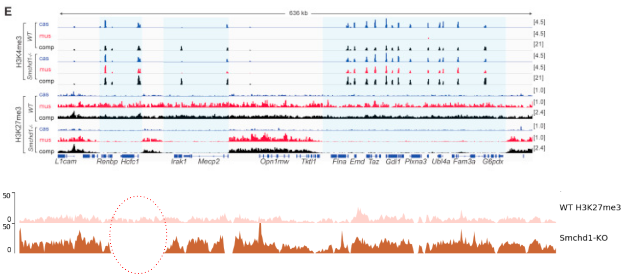
12 different sets of line graphs are shown showing various peaks along the genome. Genes are shown below the genome, some, but not all, lining up with the peaks. Below is a graphic of two line charts comparing two genomes. One has a region with no reads mapping which is circled.

Chen-Yu Wang et al. 2018; Vivek Bhardwaj, Steffen Heyne et al. 2018

Speaker Notes We probe a potential architectural role for SMCHD1 and investigate the mechanism by which it shapes the Xi and represses gene expression


Key Points

Thank you!

This material is the result of a collaborative work. Thanks to the Galaxy Training Network and all the contributors! Galaxy Training Network Tutorial Content is licensed under Creative Commons Attribution 4.0 International License.