This tutorial is a partial reproduction of Togami et al. 2022 wherein they evaluated mRNA and miRNA in a selection of COVID-19 patients and healthy controls.
While that paper uses a closed source pipeline, we’ll be reproducing the analysis with open source tools in Galaxy, using a workflow on WorkflowHub developed for the BY-COVID project.
There are several places you can jump to in this tutorial, using pre-calculated
data. We recommend you jump skipping the data download and counting step, and
skipping to the analysis, as that precludes the slowest and most data intensive
parts of this tutorial. However, the entire process is documented in case you
want to reproduce our work.
Study Design
Hands On: Data upload
Create a new history for this tutorial
To create a new history simply click the new-history icon at the top of the history panel:
Click galaxy-uploadUpload at the top of the activity panel
Select galaxy-wf-editPaste/Fetch Data
Paste the link(s) into the text field
Press Start
Close the window
Check that the datatype
Click on the galaxy-pencilpencil icon for the dataset to edit its attributes
In the central panel, click galaxy-chart-select-dataDatatypes tab on the top
In the galaxy-chart-select-dataAssign Datatype, select tabular from “New Type” dropdown
Tip: you can start typing the datatype into the field to filter the dropdown menu
Click the Save button
Analysis
We have split this workflow into three parts, based only on how long the first two portions of the workflow take to execute.
The rough runtime of the workflow portions, when this was being developed, can be broken down as follows:
Step
Time
Data Download
~6h
Processing Counts
~8h
Analysis & Visualisation
15m
These numbers were generated on UseGalaxy.eu and may not represent the most
efficient possible computation, as they are executed on a shared cluster that can, at times, be more or less busy.
As such we recommend you skip to the analysis step to progress to the interesting portion of the tutorial. We have provided in the Zenodo record data from the entire analysis,
analysed with the Download & Counts steps that can be skipped.
Hands-on: Choose Your Own Tutorial
This is a 'Choose Your Own Tutorial' (CYOT) section (also known as 'Choose Your Own Analysis' (CYOA)), where you can select between multiple paths. Click one of the buttons below to select how you want to follow the tutorial
Choose whether you want to run the time-consuming Download Data step.
Click on galaxy-workflows-activityWorkflows in the Galaxy activity bar (on the left side of the screen, or in the top menu bar of older Galaxy instances). You will see a list of all your workflows
Click on galaxy-uploadImport at the top-right of the screen
Paste the following URL into the box labelled “Archived Workflow URL”: https://training.galaxyproject.org/training-material/topics/transcriptomics/tutorials/minerva-pathways/workflows/Galaxy-Workflow-BY-COVID__Data_Download.ga
Click the Import workflow button
Below is a short video demonstrating how to import a workflow from GitHub using this procedure:
Video: Importing a workflow from URL
Run the workflow with the following parameters:
“Sample Table”: factordata.tabular
Here we have cut the SRR* identifiers from the sample table and downloaded them with fasterq, part of the SRA toolkit.
Counts
With that done, we can start to analyse the data using HISAT2 and featureCounts.
This workflow takes in the RNA Sequencing data we’ve downloaded previously, before trimming it with cutadapt.
Both the trimmed and untrimmed reads are run through FastQC for visualisation.
Click on galaxy-workflows-activityWorkflows in the Galaxy activity bar (on the left side of the screen, or in the top menu bar of older Galaxy instances). You will see a list of all your workflows
Click on galaxy-uploadImport at the top-right of the screen
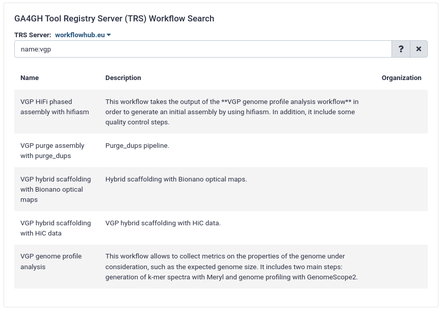
On the new page, select the GA4GH servers tab, and configure the GA4GH Tool Registry Server (TRS) Workflow Search interface as follows:
“TRS Server”: workflowhub.eu
“search query”: name:"mRNA-Seq BY-COVID Pipeline"
Expand the correct workflow by clicking on it
Select the version you would like to galaxy-upload import
The workflow will be imported to your list of workflows. Note that it will also carry a little blue-white shield icon next to its name, which indicates that this is an original workflow version imported from a TRS server. If you ever modify the workflow with Galaxy’s workflow editor, it will lose this indicator.
Below is a short video showing the entire uncomplicated procedure:
Video: Importing via search from WorkflowHub
Run the workflow with the following parameters:
This workflow produces a handful of outputs: the featureCounts results, and a
MultiQC report. Looking at the report we see generally reasonable quality data.
At the bottom of the dialog set Genome to hg19 (it is probably something like “Human Feb 2009 (GRCh37/hg19) (hg19)” but we are focused on that last parenthetical portion).
Click Upload
Now we’re ready to analyse the counts files. Here we’ll take the feature counts dataset collection and merge it into one count matrix through the use of “Column join”.
This can then be annotated with the human readable names of the genes. This is all passed to limma for differential expression analysis.
With this result in hand, we’re ready to do two further steps: preparing the dataset for goseq, and for analysis in the MINERVA Platform.
Goseq is a tool for gene ontology enrichment analysis, and the MINERVA Platform is a tool for visualising pathway analysis.
Click on galaxy-workflows-activityWorkflows in the Galaxy activity bar (on the left side of the screen, or in the top menu bar of older Galaxy instances). You will see a list of all your workflows
Click on galaxy-uploadImport at the top-right of the screen
On the new page, select the GA4GH servers tab, and configure the GA4GH Tool Registry Server (TRS) Workflow Search interface as follows:
“TRS Server”: workflowhub.eu
“search query”: name:"mRNA-Seq BY-COVID Pipeline"
Expand the correct workflow by clicking on it
Select the version you would like to galaxy-upload import
The workflow will be imported to your list of workflows. Note that it will also carry a little blue-white shield icon next to its name, which indicates that this is an original workflow version imported from a TRS server. If you ever modify the workflow with Galaxy’s workflow editor, it will lose this indicator.
Below is a short video showing the entire uncomplicated procedure:
Video: Importing via search from WorkflowHub
You should have a few outputs, namely the goseq outputs, and a table ready for visualisation in the MINERVA Platform!
The MINERVA Platform
The dataset prepared for the MINERVA Platform must be correctly formatted as a tabular dataset (\t separated values) like the following, with the dbkey set to hg19 or hg38.
If you’ve run the above workflow, this should be the case.
The tabular dataset, as prepared above is then used by a dedicated MINERVA plugin (Hoksza et al. 2019) to visualise the data on-the-fly in the COVID-19 Disease Map. To visualise and explore the data, follow these steps:
Hands On: Visualise in MINERVA
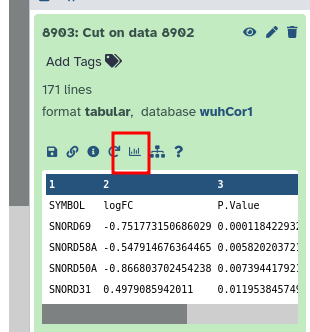
Click to expand the final “MINERVA-Ready Table”
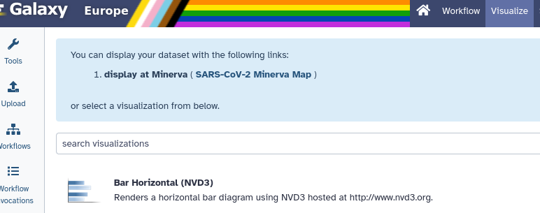
Click on the galaxy-barchart (Visualize) icon
Select “display at Minerva (SARS-CoV-2 Minerva Map)”
The MINERVA visualisation is only for correctly formatted files with the correct genome (i.e. human, hg19).
If you dont’ see MINERVA listed, first check that your dataset is:
recognised as a tabular dataset
Click on the galaxy-pencilpencil icon for the dataset to edit its attributes
In the central panel, click galaxy-chart-select-dataDatatypes tab on the top
In the galaxy-chart-select-dataAssign Datatype, select tabular from “New Type” dropdown
Tip: you can start typing the datatype into the field to filter the dropdown menu
Click the Save button
Has the correct genome build:
Click the desired dataset’s name to expand it.
Click on the “?” next to database indicator:
In the central panel, change the Database/Build field
Select your desired database key from the dropdown list: hg19
Click the Save button
It should be specifically hg19 not a patch like hg19Patch5
If that still doesn’t work, please check that the Galaxy server you are using is updated to 24.0 or later.
Analysis in the MINERVA Platform
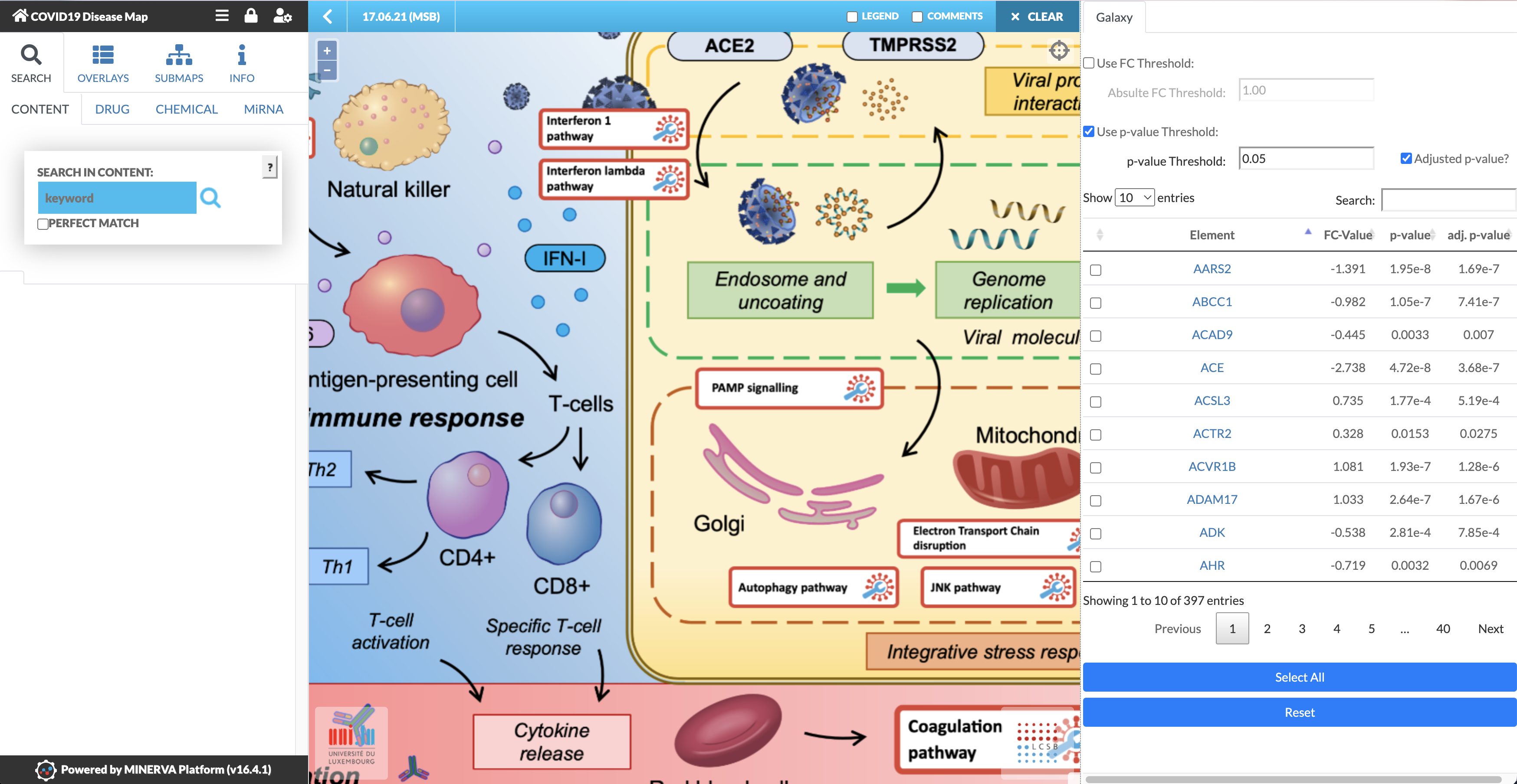
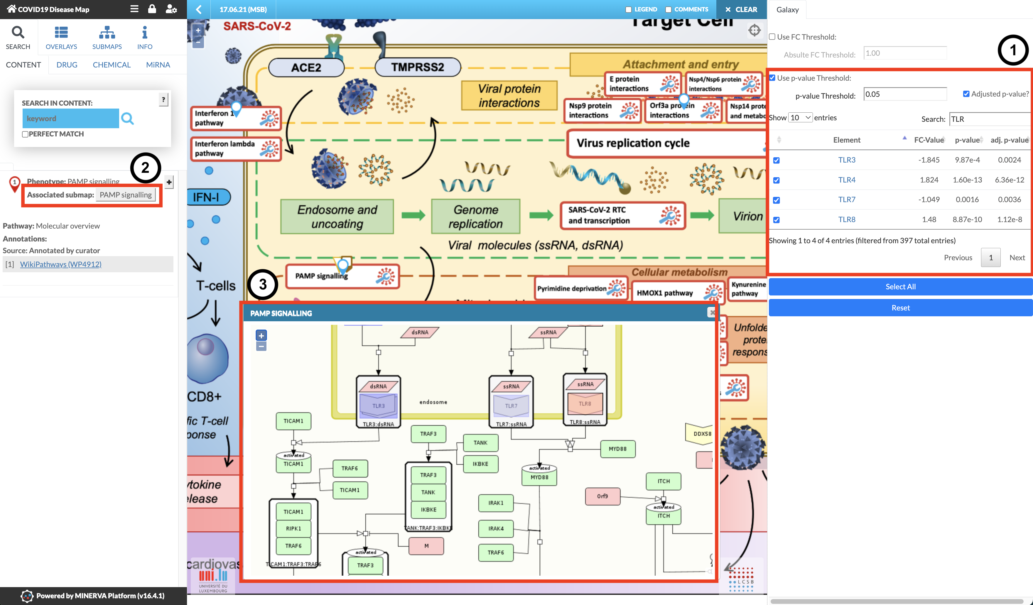
Welcome to the MINERVA Covid-19 Disease Map! It has a similar interface to Galaxy, there is an interaction menu on the left, the main area is where you’ll do your investigation,
and on the right are your datasets! In this case, the differentially expressed genes analysed above automatically loaded from Galaxy when you clicked “Display at MINERVA”.
After the loading time, marked as “Reading Map Elements”, the dataset will be visible in the right panel of the COVID-19 Disease Map, with the four corresponding columns specified earlier (see image below). The MINERVA-Galaxy plugin allows you to:
filter the data table by fold-change (FC) threshold or by p-value (default: adjusted p-value, threshold set to 0.05)
Search for specific gene symbols to display (“Search” box)
Select specific differential expression values to display in the map (checkboxes in the data tab)
Select all entries in the data table for visualisation (Select All)
Reset the visualisation
The general process of data exploration looks like:
In the main map, find pathways with matching entries indicated by blue pins.
After selecting what you want to see, browse the COVID-19 Disease Map to explore the pathways with the corresponding expression pattern.
Select a pathway of your choice and in the left panel click the “Associated submap” button
Explore the expression patterns in the diagram that will be displayed.
Hands On: Explore TLR pathways
Use the Search box above the table on the right to search for TLR.
Select all four TLR genes.
TLR3
TLR4
TLR7
TLR8
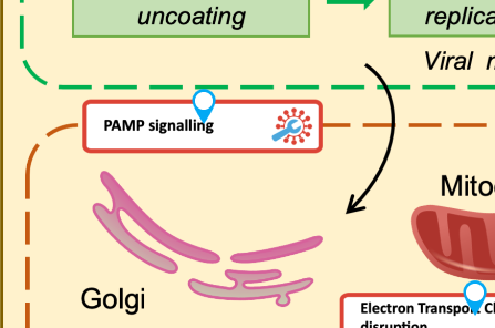
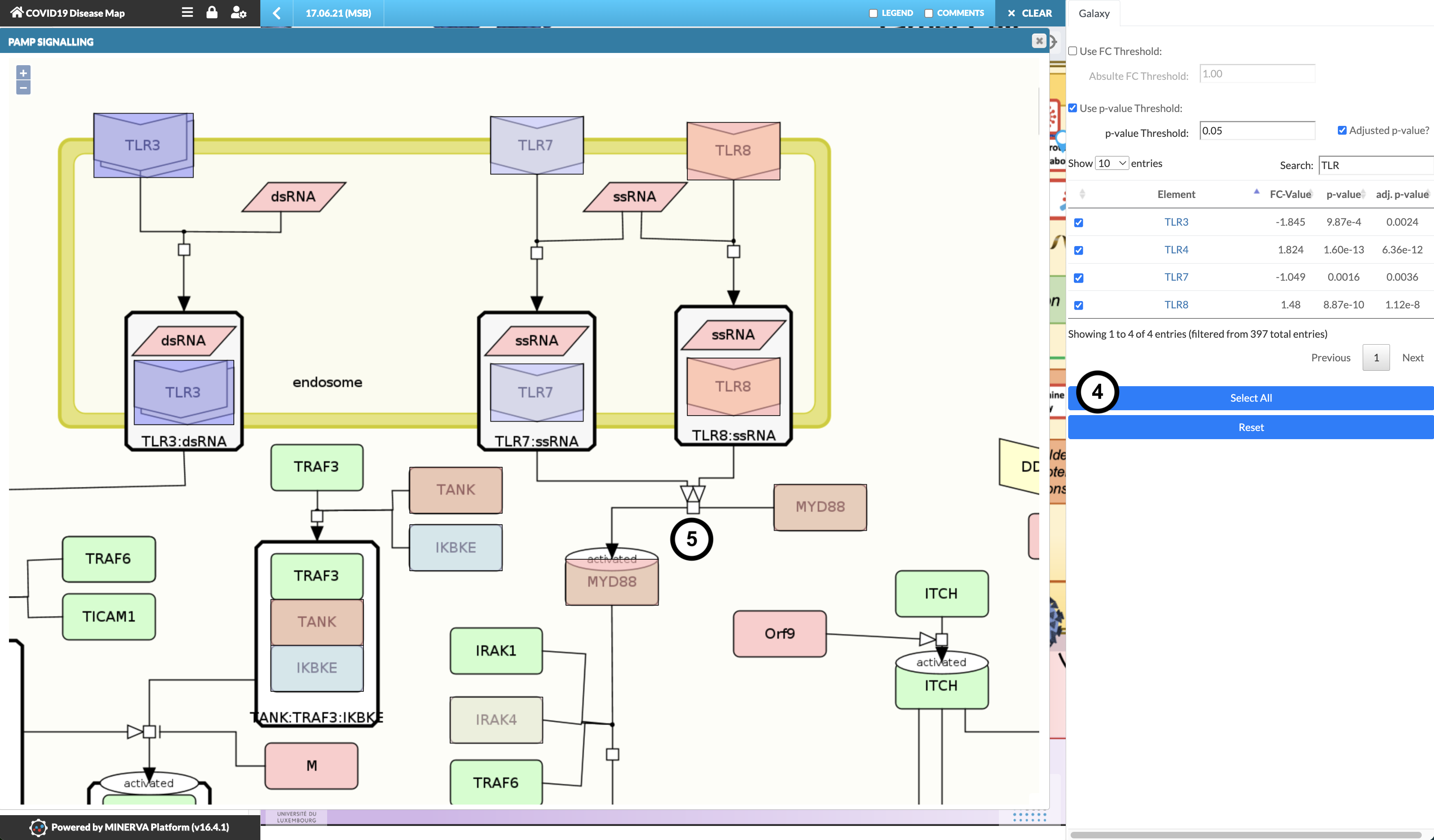
In the main map, find PAMP Signalling and click on it. (Note: don’t click the blue pin, click the pathway name)
In the left panel, click the Associated submap: PAMP Signalling button.
Explore the detailed diagram to examine the expression pattern.
Question
What is the expression pattern of TLR3, TLR7, and TLR8 in the PAMP Signalling pathway?
TLR3 and TLR7 are downregulated (cool/blue colour), TLR8 is upregulated (warm/red colour).
Without closing the PAMP Signalling submap, click “Select all” to visualise the entire data table
Question
What is the expression pattern downstream of TLR7 and TLR8, namely how are MYD88 and IRAK4 regulated?
MYD88 and IRAK4 are strongly and weakly upregulated, respectively, despite TLR7 downregulation.
Further information, including links to documentation and original publications, regarding the tools, analysis techniques and the interpretation of results described in this tutorial can be found here.
References
Hoksza, D., P. Gawron, M. Ostaszewski, E. Smula, and R. Schneider, 2019 MINERVA API and plugins: opening molecular network analysis and visualization to the community. Bioinformatics (Oxford, England) 35: 4496–4498. 10.1093/bioinformatics/btz286
Togami, Y., H. Matsumoto, J. Yoshimura, T. Matsubara, T. Ebihara et al., 2022 Significance of interferon signaling based on mRNA-microRNA integration and plasma protein analyses in critically ill COVID-19 patients. Molecular Therapy - Nucleic Acids 29: 343–353. 10.1016/j.omtn.2022.07.005
Feedback
Did you use this material as an instructor? Feel free to give us feedback on how it went.
Did you use this material as a learner or student? Click the form below to leave feedback.
Hiltemann, Saskia, Rasche, Helena et al., 2023 Galaxy Training: A Powerful Framework for Teaching! PLOS Computational Biology 10.1371/journal.pcbi.1010752
Batut et al., 2018 Community-Driven Data Analysis Training for Biology Cell Systems 10.1016/j.cels.2018.05.012
@misc{transcriptomics-minerva-pathways,
author = "Marek Ostaszewski and Matti Hoch and Iacopo Cristoferi and Myrthe van Baardwijk and Saskia Hiltemann and Helena Rasche",
	title = "Pathway analysis with the MINERVA Platform (Galaxy Training Materials)",
	year = "",
	month = "",
	day = "",
	url = "\url{https://training.galaxyproject.org/training-material/topics/transcriptomics/tutorials/minerva-pathways/tutorial.html}",
	note = "[Online; accessed TODAY]"
}
@article{Hiltemann_2023,
	doi = {10.1371/journal.pcbi.1010752},
	url = {https://doi.org/10.1371%2Fjournal.pcbi.1010752},
	year = 2023,
	month = {jan},
	publisher = {Public Library of Science ({PLoS})},
	volume = {19},
	number = {1},
	pages = {e1010752},
	author = {Saskia Hiltemann and Helena Rasche and Simon Gladman and Hans-Rudolf Hotz and Delphine Larivi{\`{e}}re and Daniel Blankenberg and Pratik D. Jagtap and Thomas Wollmann and Anthony Bretaudeau and Nadia Gou{\'{e}} and Timothy J. Griffin and Coline Royaux and Yvan Le Bras and Subina Mehta and Anna Syme and Frederik Coppens and Bert Droesbeke and Nicola Soranzo and Wendi Bacon and Fotis Psomopoulos and Crist{\'{o}}bal Gallardo-Alba and John Davis and Melanie Christine Föll and Matthias Fahrner and Maria A. Doyle and Beatriz Serrano-Solano and Anne Claire Fouilloux and Peter van Heusden and Wolfgang Maier and Dave Clements and Florian Heyl and Björn Grüning and B{\'{e}}r{\'{e}}nice Batut and},
	editor = {Francis Ouellette},
	title = {Galaxy Training: A powerful framework for teaching!},
	journal = {PLoS Comput Biol}
}
Funding
These individuals or organisations provided funding support for the development of this resource
Questions: